Maybe. Or maybe not.
The financial press and the policy makers at the Fed that set interest rates have been watching the yield curve flatten over the past year with a wary eye. When long-term rates fall below short-term rates, a recession has historically followed in one to two years. The yield curve is not currently sending such an alarming signal, but nor is it priced for the steady rate hikes anticipated by policy makers. We look at what the yield curve does and doesn’t tell us and conclude there aren’t any flashing warning signs yet. Furthermore, as the current expansion has taken over as the second longest on record, and may become the longest by year end, we can expect monetary policy to move into a more stop-and-start mode similar to the long expansions of the 1960s and 1990s. After an initial sequence of rate hikes intended to bring monetary policy to a more neutral stance, the Fed will watch the data carefully with an eye towards prolonging the expansion. The yield curve will be one gauge they watch to get policy right.
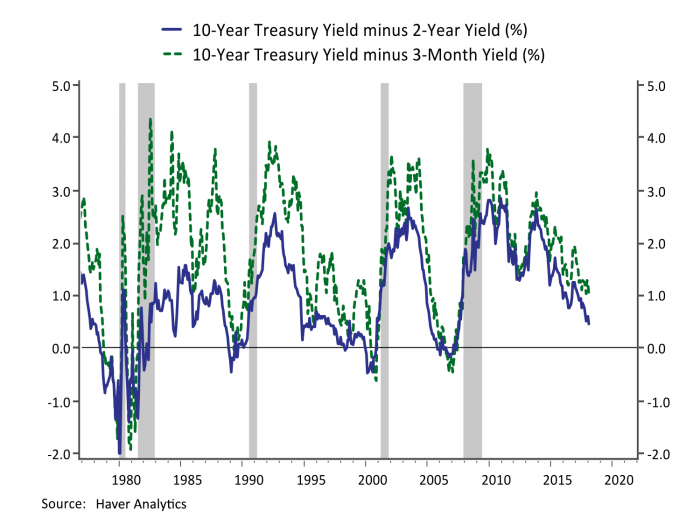
The slope of the Treasury yield curve has been getting a lot of attention lately in the financial press and among the policy makers who set interest rates at the Federal Reserve. The slope is the difference between the yield on longer-dated Treasury bonds and shorter-term interest rates, and it has been a pretty good track record as a predictor of recessions. The yield curve has inverted, so that shorter-term interest rates have risen above longer-term interest rates, between 12 and 26 months in advance of each of the post-war recession in the United States. Figure 1 shows that the spread between longer-term and shorter-term interest rates has narrowed considerably over the past several years as the Fed has been gradually raising its target fed funds rate. The spread between the 10-year Treasury yield and the 3-month TBill stands at about 0.50% suggesting that absent a rise in longer-term interest rates the curve could invert after just two more 0.25% rate hikes from the Fed, while the median projection among policy makers is for a series of seven such increases over the next three years.
Figure 1: The Yield Curve Flattens Ahead of Recessions
The minutes from the December FOMC meeting reflected a wide-ranging discussion of the factors driving the recent narrowing in the spread between the yields on long-term and short-term securities and ” several participants thought that it would be important to continue to monitor the slope of the yield curve” and “some expressed concern that a possible future inversion of the yield curve, with short-term yields rising above those on longer-term Treasury securities could portend an economic slowdown.”
In general economists see the yield curve as a leading indicator of recession rather than a cause. One causal channel could be that a flat yield curve squeezes the net interest margin at banks which in turn could produce a squeeze in credit availability. In his March press conference Fed Chair Powell acknowledged that a flat yield curve could impact financial intermediation and he would be “watching carefully” for evidence of this. The left panel of Figure 1 shows supporting evidence from the Fed’s Senior Loan Officer Survey which confirms that banks tend to tighten their standards as the yield curve flattens and inverts, although this survey only covers the last two cycles and correlation is not causation. The most recent survey shows standards easing rather than tightening suggesting no danger signals from this channel.
Figure 2: Bank Lending Standards Tighten as the Yield Curve Flattens
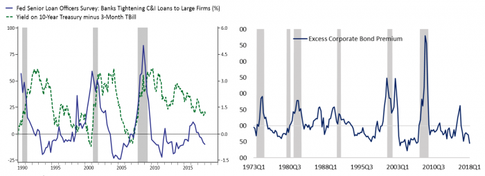
In a similar vein academic and Fed researchers have argued that a key recession indicator can be found in corporate bond spreads. The right panel of Figure 2 plot what they call “excess bond premium”, the component of corporate bond spreads in excess of an estimate of the compensation for expected default losses. This measure reflects both investor risk aversion and also represents a tightening in financing conditions that can have a causal influence on investment. The chart goes through 2018 Q1 and, like the Senior Loan Officer Survey, it shows easing risk aversion rather than any warning indicator.
Most of the focus by investors, economists and policymakers has been on what the yield curve is telling us about expectations of the future. In a paper on the topic Jonathan Wright noted that longer-term interest rates are roughly “the average of expected future short-term interest rates over a relatively long horizon” and when investors expect short-term interest rates to be lower in the future than in the present it is an indication they think monetary policy is too tight and will slow the economy.
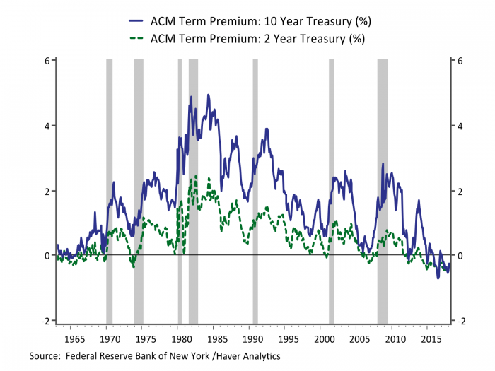
A key complication to this simple description is that longer-term interest rates embed not only expectations of short-term rates over a long horizon, but also a term premium that represents the return investors demand for taking on interest rate risk. Figure 3 shows one measure of the term premium embedded in 10-Year and 2-Year Treasury yields developed by researchers at the New York Fed. There has been a secular decline in investor compensation for interest rate risk over the past couple of decades. Indeed, the term premium on 2- and 10-year Treasury bonds are now both negative and nearly identical, implying investors are willing to pay a premium for the safety and liquidity of holding Treasuries over demanding compensation for interest rate risk. In a recent research note on this topic, researchers at the Federal Reserve Board suggested that one explanation for flatter yield curves was lower expectations for longer-run GDP growth. If investors expect lower GDP growth over a longer horizon, they may demand less compensation for interest rate risk which would lower the bar for the yield curve to flatten or even invert as the Fed raises short-term rates.
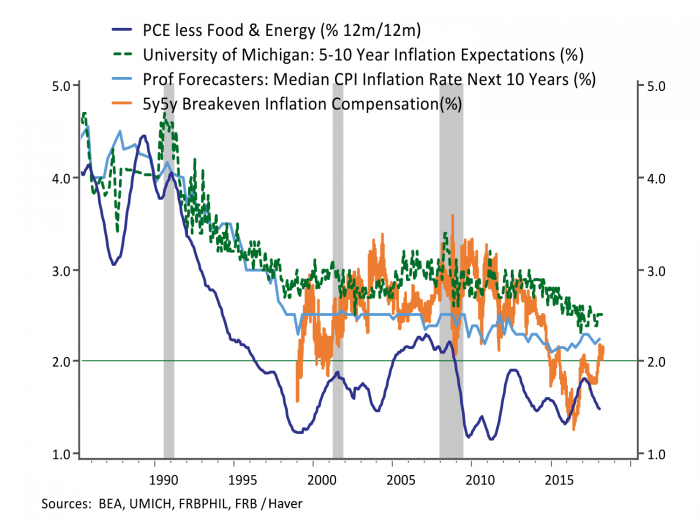
Changing inflation expectations may also be contributing to a flatter yield curve. Figure 4 shows survey measures of inflation expectations alongside measures of longer-term inflation compensation from inflation-linked Treasury bonds and the Fed’s preferred measure of core PCE inflation. Actual inflation declined before expectations, and both realized and expected inflation have been vacillating in a lower range in recent years. Reduced inflation compensation is more of a trend than a recent phenomenon, explaining the flattening in the yield curve over the past year since inflation expectations have either stabilized or improved somewhat.
Figure 3: Term Premia Embedded in Treasury Yields Have Declined
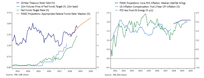
One factor reflected in the flattening yield curve is that market participants seem to have a less rosy outlook for growth and inflation than that currently held by policy makers setting interest rates. Figure 5 shows the Fed’s median projections for interest rates (left panel) and inflation (right panel) alongside market pricing. Interest rate futures aren’t pricing in as many rate hikes as the Fed over the next year, and while the Fed projects raising the funds rate to 3.25%-3.50% by the end of 2020, the yield on the 10-year Treasury bond is having a hard time breaking through 3.0%. Likewise, the Fed is projecting a slight overshoot of its 2% inflation target over the next few years, while investors are more skeptical. The inflation compensation in the chart understates the discrepancy since inflation indexed Treasuries are indexed to CPI inflation, which has averaged 0.5% higher than PCE inflation over the past thirty years. If the Fed is right about stronger growth and inflation, longer-term interest rates are likely to keep pace with shorter-term rate increases. If the market is right about a more subdued outlook, the Fed is likely to be more cautious in raising rates.
Figure 4: Inflation and Inflation Expectations are Lower, Contributing to a Flatter Yield Curve
As the business cycle matures there can naturally be a divergence of views. Investors may be overly cautious after years of a halting recovery and slow to recognize the cycle is heating up. Alternatively, the Fed has factored in fiscal stimulus into its projections but no trade or geopolitical disruptions that may be more salient to investors. The policy makers that set interest rates repeatedly stress that they are not on a preset course. They will watch the data and adjust policy accordingly with an eye towards not being the cause of the next recession. The yield curve will be one of many measures they watch for indications they may be going too far. The current expansion became the second longest on record in April, and the like the two other long expansions in the 1960s and 1990s, the Fed may feel its way on interest rates after an initial sequence of rate hikes to bring policy to a more neutral stance. The current flattening in the yield curve is consistent with an aging expansion and normalizing monetary policy, but not necessarily an indication the Fed will make a mistake by tightening policy too much and causing a recession.
Figure 5: Investors are More Cautious About Rates and Inflation Than the Fed