Healed and healthy net worth, but signs of rising inequality
The most recent update on household balance sheets shows net worth hovering near all-time highs as a percent of disposable income. The drivers of the improvement in recent years include a booming stock market, rising house values and subdued debt growth. Whether because of tighter credit standards and regulatory oversight of consumer lending or greater prudence on the part of households, consumers simply aren’t engaging in the kind of excess borrowing we saw in the years leading up to the housing crash, suggesting recent improvements in housing values rest on stronger foundations. While booming balance sheets can be a leading indicator of solid consumer spending, the benefits are highly concentrated among the wealthiest households. The recent balance sheet boom is unambiguously good news for growth prospects in the aggregate, but thornier issues of rising inequality and its social and political consequences are intensifying below the surface.
Last week the Federal Reserve released its quarterly update of the Financial Accounts of the United States with data through the first quarter of this year. Among other things, the data provide the only timely and comprehensive estimates of household balance sheets, including the value of all types of assets and debt. A key ratio watched and frequently cited by policy makers at the Federal Reserve in gauging the health of the all-important US consumer is household net worth. A commonly used metric used in forecasting consumer spending and assessing the health of household balance sheets over time is household net worth as a percent of disposable income. Net worth is calculated by summing up the total value of all financial (stocks, bonds, deposits) and non-financial (housing and consumer durables) assets and subtracting the value of all debt (credit cards, auto loans, student loans, mortgages). Net worth is then divided by disposable income to control for the fact that as long as inflation is positive the value of both will be rising over time and what we are really interested in is how much real purchasing power the consumer has.
Figure 1: Household Net Worth as % of Disposable Income Hovering Close to All Time Highs
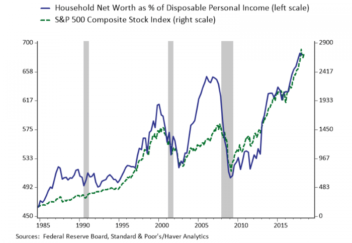
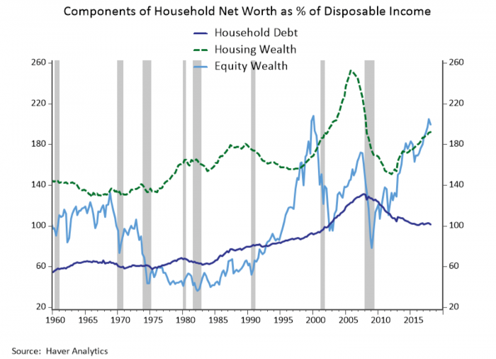
The news on household balance sheets has been very good. Even though the ratio of household net worth as a percent of disposable income dipped in Q1, as shown in Figure 1, it has reached an all-time high in 2017 Q4 powered by a soaring stock market. Their good news isn’t limited to the stock market. Figure 2 breaks out some of the main components of household net worth and shows that housing values have also been rising steadily and consumers are not taking out increasing amounts of debt in contrast to the steady increase in leverage that occurred in the decade leading up to the housing crisis. The fact that there are positive developments on multiple fronts aligns with high levels of consumer confidence across age groups and regions and suggests that the cycle still has some staying power.
Figure 2: Rising Equity and Housing Values and Lack of Leverage Drive Improvements in Net Worth
We have noted before that our own Morris Davis helped write the book on how and why gains in household wealth translate into consumer spending. Wealth effects on consumption are one component considered when the Fed forecasts consumer spending. Households save to accumulate wealth in part to finance spending over a long horizon, so it is only a small portion of unanticipated gains in wealth that tend to make households feel a bit better off and lead them to save less and spend more. The left chart in Figure 3 plots the personal saving rate against the inverse of householt net worth as a percent of disposable income to illustrated that recent gains in wealth have indeed been associated with a decline in the saving rate, although the response hasn’t been quite as aggressive as during the housing boom.
Figure 3: Consumers Are Saving Less but Not Taking on Excess Debt
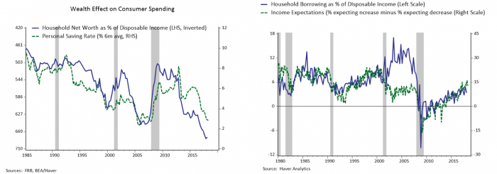
Prior research has shown that the ebbs and flows in the personal saving rates associated with the wealth effect tend to be concentrated among higher-income households that hold most of the wealth. In the housing boom the wealth effect on consumption became a broader-based phenomenon as the access to mortgage credit expanded and home equity extraction became a common method of financing consumption. The right chart of Figure 3 plots household borrowing as a percent of disposable income against a measure of consumers’ income expectations. The chart illustrates that the rate of borrowing during the housing boom far outstripped any underlying optimism about income prospects highlighting that such borrowing was likely to prove unsustainable, and the rest is history. There are two positive developments highlighted in the chart: First, households are growing increasingly optimistic about their income prospects. Second, they are not borrowing beyond what can be reasonably justified by their income expectations. Thus, while housing values have been climbing steadily in recent years, those valuations do not appear to be fueled by a vicious cycle of unsustainable borrowing that will ultimately come crashing down.
Figure 4: Rising Interest Rates Mean Rising Debt Service but Lack of Leverage Means Balance Sheet Gains
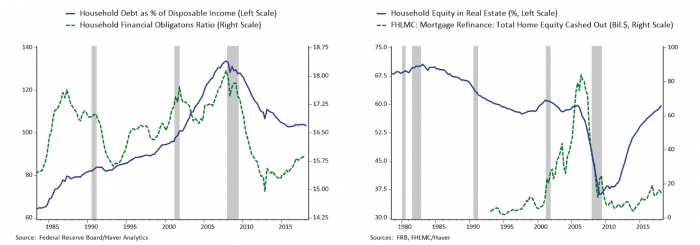
Whether it reflects tighter credit standards and regulatory oversight of mortgage and consumer lending or greater prudence on the part of households, the left panel of Figure 4 highlights that household debt as a percent of disaposable income has basically held steady over the past three years, after years of unprecedented deleveraging. The chart also includes the Household Financial Obligations Ratio calculted by the Fed that represents that percent of disposable income required to service debt and other financial obligations (including rent and auto leases). Monetary policy helped support households and facilitate deleveraging after the financial crisis through lower interest rates that pushed the burden of debt service for all-time lows despite the overall stock of debt remaining elevated. More recently the financial obligations ratio has been creeping up as the Fed has raised interest rates, although it remains low by historical standards.
The healing in household balance sheets is evident in the fact that the amount of home equity, illustrated in the right chart of Figure 4, has returned to pre-crisis norms. The chart also shows the amount that households are extracting from their homes through cash-out refinancing transactions. While cash-out refinancing has risen in recent years as valuations of home equity have improved, it remains quite subdued relative to the boom years, further bolstering the conclusion that valuations are not rising on shaky foundations and consumers are continuing to exercise prudence.
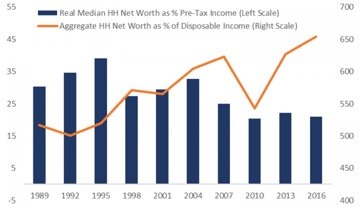
Housing is the primary asset for most households. Data from the most recent Survey of Consumer Finances conducted in 2016 shows that equity ownership, including stocks held directly and indirectly through retirement accounts and mutual funds, still stands at just over half of all US households, where it has been since the mid-1990s, while 64% of households own a home. The main fly in the ointment of an otherwise rosy picture of the household balance sheet is illustrated in Figure 5, which is that the boom in household wealth is not widely shared. The chart plots median real household net worth as a percent of pre-tax income from the Survey of Consumer Finances against aggregate household net worth as a percent of disposable income from the financial accounts for the years the SCF was conducted. The two measures aren’t identical but should broadly capture the real purchasing power of household balance sheets in the aggregate and for the median household.
Because the median household holds very little equity, they have not shared in the equity market boom, and their net worth has basically been treading water for nearly a decade. The net worth of the median household is also only 20 percent of their annual income as compared with aggregate net worth that is more than six times disposable income. So while it is good news that households have largely healed from the housing crisis and the seeds of a new crisis aren’t being sown, the median household is aging with very little saving and will be reliant on support from social insurance programs that are currently underfunded.
The rising inequality on household balance sheets also presents an inconvenient truth for Federal Reserve policy makers. Figure 1 confirms that business cycles are increasingly associated with rises and falls in asset values. The Fed’s unconventional policies were often criticized for exacerbating inequality by supporting the stock market. That appears to be a fair criticism, although bull markets are also associated with the type of thriving labor market we have seen of late, which is the only way to broadly share the fruits of the recovery. Ultimately distributional issues fall to the domain of fiscal policy, and the recent tax cut only tilts the scale further toward those at the top of the distribution. The recent balance sheet boom is unambiguously good news for growth prospects in the aggregate, but thornier issues of rising inequality and its social and political consequences are intensifying below the surface.
Figure 5: The Wealth Boom is Not Broadly Shared