Risk and return to single-family housing in New Jersey
Is owning a home in New Jersey a “good” investment?
It turns out that answering this seemingly simple question is complicated because it leads to other questions. What does it mean to be a good investment? Good investment relative to what? Good investment for whom?
To get going, I answered a different but related question. If a person has extra cash lying around that they want to invest for a year, will they earn a higher return if they
- buy a single-family house, rent it out and then sell it after a year,
- buy a portfolio of stocks, or
- buy a portfolio of bonds?
And, does the answer vary by location in New Jersey?
You might argue an appropriate holding period for a home-owner is not one year but maybe 10 years or longer, since homeowners do not move frequently. After a lot of fretting and hand-wringing, I chose a one-year hold period for two reasons. First, and most importantly, it makes my calculations with respect to housing more directly comparable to those typically done with stocks and bonds. Second, many people should care about housing returns even if they don’t plan on moving. The reason is that there is always some chance they will unexpectedly have to move for job, family, and health reasons.
The one-year real return to an asset is defined as the sum of two parts: (i) the income the asset produces over the course of a year plus (ii) any change in real value to the asset over the year, i.e. any change in asset value over and above what would be predicted given the overall rate of inflation. The second part is always called the “real capital gain”. The first part is called the “dividend yield” or “income yield” for stocks and bonds and the “rental yield” in real estate.
To reiterate: the one-year real return to housing = rental yield + real capital gain
Notes on Data
As I will show, the returns to stocks, bonds and housing change from year to year, implying we need plenty of good historical data to characterize average returns on those assets. The data on stocks and bonds are readily available and quite complete – I have included a list of data sources at the end of this blog – but many important data about housing returns are still unavailable. The finest level of geography I can analyze housing returns is at the zip-code level. Of the 739 zip codes in all of New Jersey, I can assemble all the data for 371 zip codes over the years 1987-2014. Note that zip-codes I include cover quite a bit of the population of the state. The availability of housing data by zip code declines rapidly prior to 1987, explaining the start date.
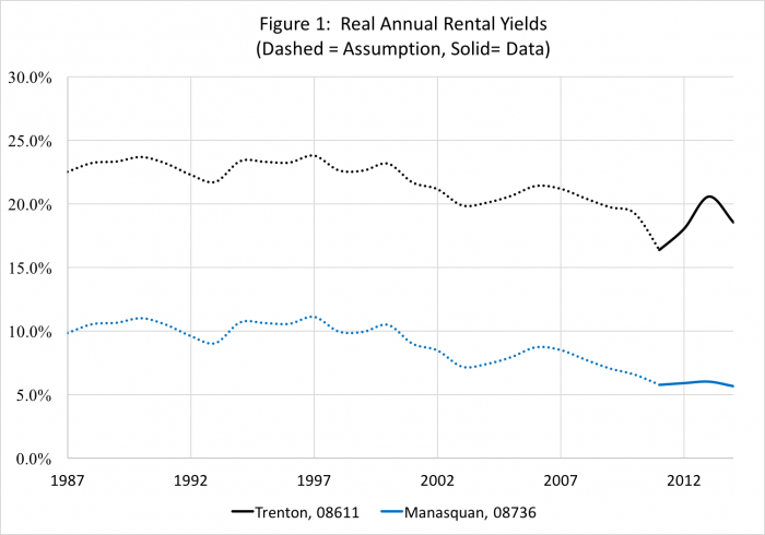
Before continuing, I need to briefly discuss one giant hole in the housing data. For rental yields, I use data from Zillow on the “price-rent” ratio. I compute the rental yield as the inverse of the published price-rent ratio, less an allowance for depreciation, maintenance and property tax that I assume is 5 percent in all zip codes in New Jersey (this assumption matters). The Zillow price-rent data are available by zip code starting in 2011 but are not available before then. To proceed, I need to make some assumptions about rental yields, by zip code, from 1987-2010. Prior to 2011, I assume that rental yields in every zip code rise and fall in lock-step with changes in the real yield on the 5-Year US Government Treasury bond. The yield on this bond (and others) has fallen dramatically over time. Figure 1 shows two examples from the data, Trenton (black) and Manasquan (blue). Between 2011 and 2014, the average rental yield in Trenton was 18.4% and the average rental yield in Manasquan was 5.8%. I assume rental yields for both Trenton and Manasquan have declined about 4 percentage points between 1987 and the average of the post-2010 period, reflecting changes in the real yield on the 5-year Treasury. This assumption preserves the spread in rental yields between Manasquan and Trenton that is in the 2011-2014 data, but is not otherwise innocuous. As examples, if real yields had fallen faster in Mansquan than Trenton or yields on both places had been flat over time, this might dramatically affect our results.
Results Over Time
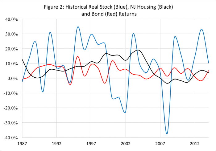
So, what did I find? Figure 2 plots historical stock (blue), bond (red) and New Jersey housing (black) returns and Table 1 summarizes the data. The housing return that is shown is the median real return in each year for the 371 zips in the sample. Two results jump out. First, stocks pay a higher average real return than housing (when measured at the median) which pays a higher return than bonds: 9.7 percent per year for stocks, 6.8 percent for housing and 4.3 percent for bonds. Second, as measured by the standard deviation of returns, stocks are more volatile than housing (measured at the median), which is more volatile than bonds. The standard deviation of annual returns is 17.8 percent per year for stocks, 6.4 percent for housing and 4.5 percent per year for bonds.
Table 1 also shows in the third column a statistic called the “Sharpe Ratio”, which is defined as the average return, column 1, less the risk free rate (RF), 1.7 percent in our sample period, divided by the standard deviation of returns, column 2. The Sharpe Ratio is 0.45 for stocks, 0.59 for bonds and 0.80 for New Jersey Housing. The Sharpe Ratio is a measure of risk-adjusted return, because it describes how much volatility an investor has to assume to earn a given return over and above the risk-free rate. All else equal, investors should prefer assets with high Sharpe Ratios – these assets provide higher returns at lower levels of volatility and presumably risk. As measured by the Sharpe Ratio, when measured at the median zip in each year, housing in New Jersey has paid a higher risk-adjusted return than stocks or bonds, despite the large recent boom and bust to house prices that has received so much attention.
| Table 1: Results from 1987-2014 for Stocks, NJ Housing and Bonds | |||
| Average Real Return (1) |
Std. Dev. of Real Returns (2) |
Sharpe Ratio (3) = (1 – RF) / 2 |
|
| Stocks | 9.7% | 17.8% | 0.45 |
| NJ Housing (Median Zip) | 6.8% | 6.4% | 0.80 |
| Bonds | 4.3% | 4.5% | 0.59 |
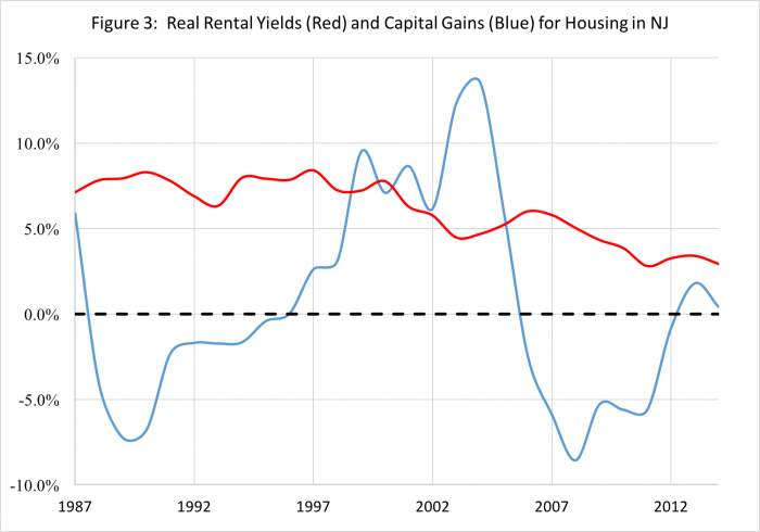
So, why does housing in New Jersey pay a relatively high rate of return? The answer is: Rental yields. Figure 3 shows annual real rental yields (red) and real capital gains (blue) in New Jersey. Each of these returns are measured at the median zip in each year — the zips do not have to be the same. Although they have been declining over time, consistent with the decline in the real 5-year Treasury Bond, real rental yields have always been positive and are not particularly variable. The capital gains paid to housing in New Jersey are more volatile and the housing boom (1996-2006) and bust (2007-2012) is quite visible on this graph. Capital gains are also often negative: the blue line is less than 0 for more than half of the sample.
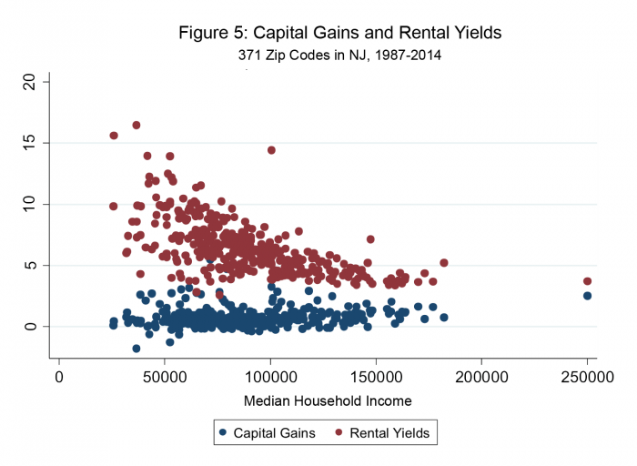
When measured at the median zip code, homeowners in New Jersey have experienced real appreciation of about 0.6 percent per year and enjoyed a rental yield of 6.1 percent per year. The relatively high real returns to housing in New Jersey are attributable to the fact that house prices are low given rents.
Results Across New Jersey
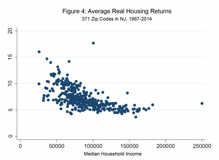
One question that has come up is whether housing is an equally good (or bad) investment everywhere in New Jersey. After all, Figures 2 and 3 might mask tremendous variation in the data across zip codes. To get at this, I look at how returns vary with 2015 median household income in each zip code. (For those that are interested in reviewing the data themselves, I have made all the data for New Jersey available in this Excel spreadsheet. Interestingly, Figure 4 shows that the average real return to housing tends to be highest in zip codes associated with the lowest household incomes.
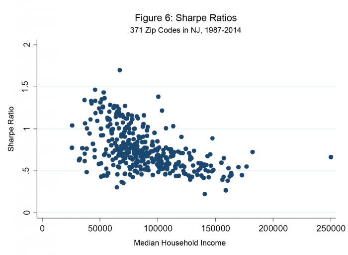
To understand what causes this result, Figure 5 shows average real capital gains by zip code (blue) and average real rental yields by zip code (red) against median household income. Although the expected rate of capital gains rises with income, the level of capital gains is low relative to the level of rental yields. Thus, the fact that real rental yields falls with income (Figure 5) implies that real housing yields declines with income (Figure 4). And, since rental yields are relatively stable, Sharpe Ratios — and thus risk-adjusted returns to housing — are highest in lower income neighborhoods, shown in Figure 6.
Summary
When measured using the tools and theory of modern finance, housing does not appear to be a “bad” investment in New Jersey. The rate of return paid to housing lies squarely between returns paid to stocks and bonds. A comparison of Sharpe ratios suggests the risk-adjusted rate of return to housing in New Jersey might be high relative to both stocks and bonds.
Housing in New Jersey does not pay a high rate of return because of steep expected price growth. To the contrary, on average real house price growth is low and for half of the sample period was negative. Instead, the rental yield on housing is high even after accounting for taxes and depreciation. Restated, in many places housing is cheap given market rents.
Interestingly, rental yields are highest in many zip codes in New Jersey with the lowest household incomes. This implies that the expected return to housing falls as neighborhood incomes rise. One interpretation of this result is that housing is an especially good investment for people living in relatively low-income neighborhoods. Although house prices may never be expected to rise in those areas, and might even fall, rents in those areas are expensive relative to house prices and thus owning provides for a high rate of return. A different interpretation is that rental yields are high in those areas to compensate owners for unspecified “risks” that are not related to volatility.
For poor people, rents are “too damn high” given house prices. This last result is directly related to housing affordability for the poor. Consider a person making $24,000 and living in zip code 08611, Trenton, NJ. Suppose (and these numbers are rough) this person can rent at house at $1,000 per month or buy an equivalent house for $60,000. If the person rents, she will spend 50% of her income on rent. By most definitions, this is an unaffordable situation. If she buys using a 30-year fixed rate mortgage with a minimal down payment, her monthly mortgage payment, taxes and insurance should be no more than $600 per month. As long as maintenance costs are reasonable, her spending on her house will accounts for only 30% of her income, a very affordable situation. This is not to say that the solution to the housing affordability problem is to stuff all poor people into homeownership. A key first step is simply to understand why rents are so high relative to prices for the poor. Once we understand this problem, perhaps we can correct it.
Finally, as a cautionary note, I remind readers that the rental yield data were put together with some guesswork prior to 2011. More and better historical data are needed on this important topic.
Data Sources
- Price index for Consumption used to compute 1-year inflation rates (Table 2.3.4 line 25)
https://bea.gov/iTable/iTable.cfm?ReqID=9&step=1#reqid=9&step=3&isuri=1&903=64 - 5-Year Treasury Constant Maturity Rate used to determine rental yields prior to 2011
https://fred.stlouisfed.org/series/DGS5#0 - 1-Year Treasury Constant Maturity Rate used to determine RF (the risk free rate)
https://fred.stlouisfed.org/series/DGS1 - Stock Returns (Fama/French 3 Factors data, use the variable “Rm”):
http://mba.tuck.dartmouth.edu/pages/faculty/ken.french/data_library.html - Bond Returns (VBMFX Index):
https://finance.yahoo.com/quote/VBMFX/history?ltr=1 - Rent-Price Ratio by Zip Code:
https://www.zillow.com/research/data/ - House Price Index by Zip Code:
https://www.fhfa.gov/PolicyProgramsResearch/Research/Pages/wp1601.aspx - Median Household Income in the past 12 months, 2015 inflation-adjusted dollars (2011-2015 American Community Survey 5-Year Estimates)
https://factfinder.census.gov/faces/tableservices/jsf/pages/productview.xhtml?pid=ACS_15_5YR_B19013&prodType=table
