It’s a bubble watch on bond yields
In this post we take a look at how far the recent rise in bond yields might go and conclude somewhat surprisingly that the yield on the 10-year Treasury may not rise much above 3%. A simple rule of thumb that equates the 10-year Treasury to average growth in nominal GDP minus a spread that could reflect a safety or liquidity premium has done a surprisingly good job over the better part of sixty years. It would likely require evidence of a sustained improvement in productivity growth and/or higher inflation to see yields rise materially above 3%. More sophisticated assessments of fair value suggest greater overvaluation in Treasuries, but may have some identification issues. Meanwhile risky assets have been arguably the greater beneficiary of global and central bank liquidity and are also at risk with policy tightening around the globe and an aging expansion.
The KISS Approach to Understanding Bond Yields (Keep It Simple Stupid)
I will focus on examining whether the 10-year Treasury yield is fairly valued for a variety of reasons. First, it is the benchmark rate used to price mortgages in the US and is therefore a key influence on the economy. Since a 10-year interest rate can be thought of as the average of one-year interest rates over the next ten years, it can also be thought of as a cyclically adjusted interest rate as any ten-year period is more likely than not to feature a business cycle with corresponding increases and decreases in the short-term rates set by the Federal Reserve. The 10-year Treasury is also one of the most actively traded securities, suggesting there are few distortions and good price transparency. Treasury yields are typically also thought of as the benchmark of safety, so we can talk purely about interest rates and set credit risk aside for the moment.
Interest rates can be broadly thought of as the time value of money since it is the return a saver earns for giving up access to their money today, so they can use it at a later time. The return a saver demands should be related to prevailing real returns plus the rate at which savers expect inflation to erode the real value of their money. The left panel of Figure 1 shows that the interest rate on the 10-year Treasury bond has declined more or less steadily in recent decades, from a peak close to 15% in the early 1980s to less than 3% over the past seven years.
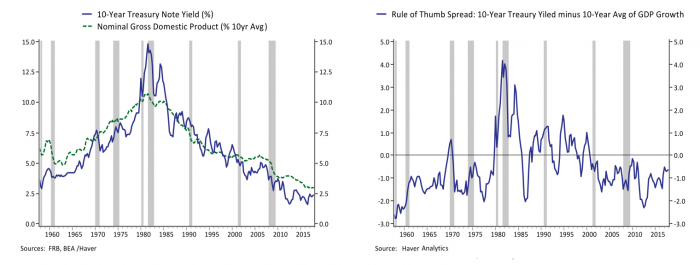
The left panel of Figure 1 plots the Treasury yield against a standard rule of thumb. Since the 10-year Treasury yield should be related to real returns plus inflation, the investing and trading world often use nominal GDP growth as a benchmark for where the 10-year Treasury yield should gravitate toward over time. The left panel of Figure 1 plots the 10-year Treasury against a 10-year average of nominal GDP growth, and the right panel shows the gap between them. Treasury yields have moved fairly closely with a longer-term average of GDP growth. Yields have generally been below average GDP growth over the past sixty years with the exception of the 1980s and 1990s. Over the past twenty years Treasury yields have been about 1% below average nominal GDP growth. Currently the ten-year average of nominal GDP growth is 3.0%. Nominal growth picked up to 4.4% in 2017 and the yield of the 10-year Treasury has risen from an average of 2.37% in Q4 2017 to greater than 2.80% in recent weeks.
The Rule of Thumb Says We Are in a Good Place
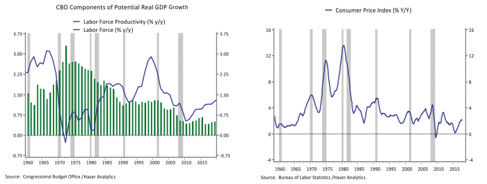
In thinking about where yields might go from here it is worth considering what has driven the ups and downs in nominal GDP growth over the past sixty years. The left panel of Figure 2 plots the Congressional Budget Office’s parsing of the components of real potential GDP growth. Real GDP is driven by growth in the labor force, and growth in the productivity of the labor force. Real potential GDP growth averaged above 4% in the 1960s on solid labor force and productivity growth. Potential growth slowed to just above 3% in the 1970s as productivity gains took a dive but the labor force ballooned on the entrance of the baby boomers. Growth held above 3% in the 1980s as productivity recovered even as labor force growth slowed, and the productivity miracle helped offset moderating labor force growth in the 1990s keeping growth potential above 3%. The last twenty years have seen a slowing in both labor force and productivity growth, leading real potential growth to slip to below 2%. Meanwhile, the right panel of Figure 2 plots consumer price inflation and illustrates that a boom and bust in inflation was an additional influence in the rise and fall in Treasury yields over the past sixty years.
Going forward the CBO projects that real potential GDP growth will pick up from the low of 1.0% in the immediate aftermath of the financial crisis in 2010 to 1.8% in coming years as a recovery in productivity growth helps offset continued moderation in labor force growth. If one assumes the Fed is successful in achieving inflation centered around 2%, nominal GDP growth should average 3.8%. If the gap between nominal GDP growth and Treasury yields continues to average 1.0%, then the 10-year yield is about right at 2.8%.
What About All This Talk of Bond Bubbles and Conundrums?
How can we square the above conclusion that the yield on a 10-year Treasury is now in reasonable territory with the stern warnings this year from market savants – from Alan Greenspan to Ray Dalio to Bill Gross – that we are in the early stages of the bursting of a bond market bubble? How can I square it with my own analysis a few weeks ago looking at the doubling in Treasury issuance this year and tightening in monetary policy that could dramatically alter the balance between supply and demand this year pushing yields higher?
There are of course much more sophisticated and complicated ways to assess fair value on Treasury bonds. A standard approach by economists is to decompose Treasury yields into the expected future path of short-term rates set by the Federal Reserve and a term premium. The term premium is the risk premium investors demand for taking on the interest rate risk from holding a longer-term security. The term premium is not observable and so must be teased out through quantitative methods. A classic example is described by researchers at the New York Fed, and their resulting estimate of the term premium on the 10-year Treasury bond over the past sixty years is shown in the left panel of Figure 3. Consistent with the simple rule of thumb, the term premium estimated by Adrian, Crump, Mills and Moench (ACM) was highest during the 1970s and 1980s, perhaps reflecting uncertainty over the prospects for interest rates that came with rising inflation and plunging productivity.
In contrast to the simple rule of thumb, the ACM estimate indicates that the risk premium embedded in the 10-year Treasury yield dropped to close to zero in 2005, when then Fed Chair Alan Greenspan testifying before Congress wondered at recent declines in 10-year yields despite a solid economy and rising short-term interest rates, noting “for the moment, the broadly unanticipated behavior of world bond markets remains a conundrum.” The right side of Figure 3 shows that while 10-year yields nudged a bit higher in the two years after his speech, the Fed kept hiking rates beyond those yields leading to an inverted yield curve (when short-term rates set by the Fed are higher than longer-term rates) and a recession followed not long after. Currently the ACM term premium has been negative for the better part of three years.
One way to reconcile the rule of thumb with the ACM term premium is suggested by a recent paper titled “Interest Rate Conundrums in the Twenty-First Century” which suggests that there can be two different kinds of investors: those focused on short-term rates and Fed policy at high frequencies, and patient investors focused on longer-run fundamentals. One implication I draw from this analysis is that the ACM term premia could be mis-measured since it relies on the expectations of short-term investors to parse the term premium from the overall yield. Investors focused on near-term Fed policy, like the Fed itself have tended to overestimate how much the Fed might raise rates which would lead to an underestimate of the term premium earned by investors. Fed officials like to stress that business cycles don’t die of old age, but when the Fed is raising rates and the economy is closing in on full employment, longer-term investors may be more focused on the fact that the probability of a recession over the next ten years is on the rise and incorporate that into their required return on the 10-year Treasury bond.
There is an active debate in the investing community, and an active discussion among Fed officials currently, as to whether an inverted yield curve is a signal of a coming recession. The relationship between a flat or inverted yield curve and a recession isn’t causal, but it may reflect the simple probability that when an economy reaches full employment there is less cyclical strength to buffer any shocks and recession probabilities are therefore higher. That probabilistic reality may result in a lower yield demanded by longer term investors on bonds, an inverted yield curve and at some point, a recession.

The Global Savings Glut and the Portfolio Balance Channel
Former Fed Chair Ben Bernanke coined the term “global savings glut” about the same time Greenspan declared a bond conundrum out of largely the same surprise over low longer-term bond yields. The savings glut was a diagnosis that stubbornly low bond yields resulted in part from capital inflows from foreign investors running large trade surpluses. In that event what appeared to be inexplicably low bond yields fell further alongside growth and inflation during and after the Great Recession.
While in retrospect bond yields in 2005 don’t look so out of whack with growth and inflation, Bernanke wasn’t necessarily wrong that the inflow of foreign capital was boosting the value of US assets. When the fed implemented quantitative easing in the aftermath of the financial crisis, one of the primary channels it was thought to work through was the portfolio balance channel. The idea is based on ideas set forth by eminent scholars James Tobin, Milton Friedman and Franco Modigliani, among others. Bernanke explained that in the case of QE, when the Fed bought a mortgage security or Treasury bond it reduced the supply of those securities available to investors, and that “as investors rebalance their portfolios by replacing the MBS sold to the Federal Reserve with other assets, the prices of the assets they buy should rise”. In other words, rising liquidity lifts all boats.
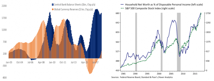
Figure 4 shows the growth in foreign dollar reserves that started in the early 2000s, and how it was replaced with liquidity from central bank asset buying programs in the crisis. Most recently, slower economic and credit growth in China in 2015 and 2016 was met with accelerated bond buying from the European Central Bank and the Bank of Japan. The right side of Figure 4 shows US household net worth as a % of disposable income. Household balance sheets have become highly procyclical in recent decades, much more so than the 10-year Treasury yield. In the 1990s and the current expansion rising household net worth largely reflected booming equity valuations. In the 2000s households saw epic appreciation in their homes as well. As the Federal Reserve is joined by China and the ECB in belt tightening this year, it may be felt both in somewhat higher bond yields, as well as in other asset prices through the portfolio balance channel.
It still seems the direction of travel in the near term is toward higher rates on 10-year Treasury bonds based on a doubling in the supply the market must absorb this year and tighter Fed policy; yields above 3% would be perfectly consistent with current prospects for growth and inflation. But it would likely require evidence that productivity growth and/or inflation was moving higher on a sustained basis to lead to pushing yields back above 4% or higher. As we have seen this year, there may very likely be a continued back and forth between rising yields and the valuations for riskier assets, in part because the longer the expansion lasts, the more investors with a longer horizon may value a little insurance.