
Today we’ll examine the “employment elephant” one more time!
Executive Summary: Today we’ll examine the “employment elephant” one more time. First, we’ll return to state data, documenting some key points about the relationship between state employment growth and state population growth. We’ll also take a quick look at the relationship between employment growth and income growth. Second, we will examine sectoral differences in employment growth in New Jersey using techniques of “location quotients” and “shift-share analysis.” Third, we will discuss the relationships between employment growth and some housing market outcomes.
Population and Employment Among States
Over long periods – a few decades or more – the principal determinant of employment growth is population growth. Exhibit 1 shows, unsurprisingly, that over three recent decades plus (1980 to 2015) about 94 percent of the variation in state employment growth is explained by population growth.
Exhibit 1 also shows that the tri-state area is well below the national average in both employment and population growth. Over this 36 year period, U.S. population grew at 1 percent per annum, and employment grew at 1.5 percent per annum. Employment growth was faster than population growth over this period partly because during the period the tail end of the baby boomers were still moving into the labor force; but in recent years that relationship has been reversed, with employment growth rising more slowly than population, as the boomers retire and labor force participation falls.
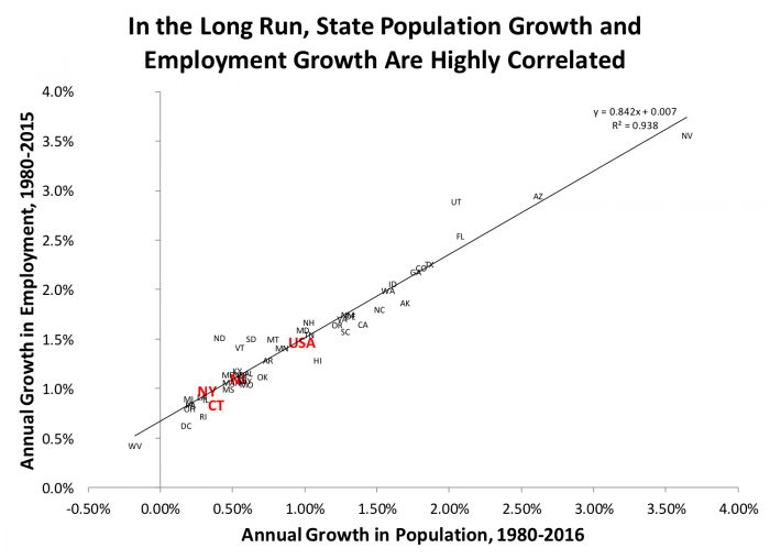
New Jersey’s growth is weaker than the nation’s; our population grew at 0.5 percent and our employment at 1.1. percent. This performance was a little stronger than New York (0.3 percent growth in population, 1.0 percent growth in employment) or Connecticut (0.4 percent population growth, 0.8 percent employment growth). All three states have employment growth close to what would be predicted by the simple relationship between employment growth and population growth among the 50 states (with Connecticut a shade below).
While the long run correlation between population growth and employment growth is very high, in the short run business cycle effects, the rise and fall of demographic cohort’s, and changes in labor force participation, among other factors, can loosen the relationship. Exhibit 2 shows that the relationship between employment and population growth in the post 2009 recovery from the great recession, while positive, is significantly weaker than the long-run relationship presented in Exhibit 1 above. In general, the strength of the relationship will vary depending on the time period chosen.
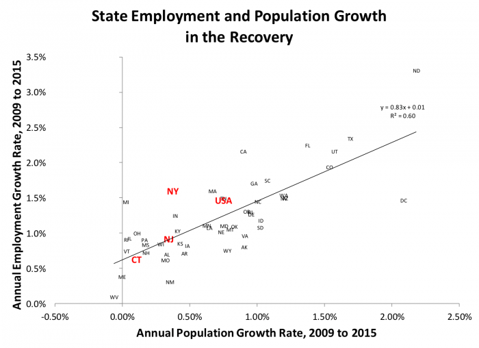
In Exhibit 2 again we see the tri-state area lagging the nation in population growth; but in this particular period, New York’s employment growth at a healthy 1.6 percent per annum, exceeds national averages as well as the growth rates for New Jersey (0.9 percent) and Connecticut (0.6 percent).
We’re Always Talking About Jobs – But Other Indicators Matter, Too
When politicians and policy advocates talk about local economies, the focus is often on employment; sometimes in the past this is been almost to the exclusion of other matters. Recently, discussion of incomes has been coming more to the fore, partly because of increasing awareness of stagnant income growth in the past decade or so for middle-income and lower-income Americans, and because of shifts in the distribution of income and wealth. These are, of course, topics to tackle more fully in future blog posts. Here, I simply want to demonstrate that in the long run, employment growth and income growth don’t show that strong long run correlation that we saw above between employment and population.
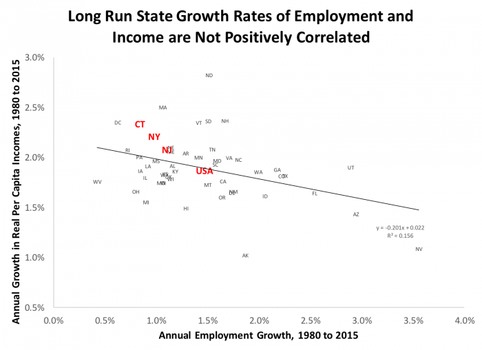
Exhibit 3 uses the same employment growth as above, but this time compares it to annual growth in real per capita income from the Bureau of economic analysis. Notice that the long-run relationship between employment growth and income growth is much weaker than that between employment growth and population growth. In fact, the relationship is slightly negative over this period. Notice however that, in contrast to employment growth, real income per capita grew faster in the tri-state area than in the U.S. as a whole. Connecticut’s long-run income growth came in at 2.3 percent per year (inflation-adjusted) with New York and New Jersey close behind at 2.2 percent and 2.1 percent respectively, all above the national average of 1.9 percent.
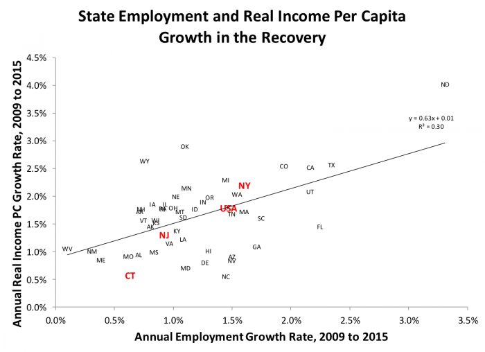
Once again, as Exhibit 4 shows, the relationship between employment and income growth are different in the short run and in the long run. During the recovery, the relationship between employment and income, while still somewhat loose, is now positive. New York State has enjoyed strong recovery in both income (2.2 percent) and employment, a little stronger than the nation as a whole (1.8 percent income, 1.6 percent employment). New Jersey has lagged behind (1.3 percent income, 0.9 percent employment) and Connecticut has performed poorly (0.6 percent, 0.6 percent) on both counts.
The Structure of New Jersey’s Employment
In our post on employment from two weeks ago, we examined the behavior of employment in several industries, using national data. We found this disaggregated data often performed very differently than overall employment. Here we’ll take a look at the details of New Jersey’s employment by sector, using some common tools of regional economists.
Our first tool, the location quotient, is the share of the region’s jobs in an industry divided by the share of the nation’s jobs in the industry. It’s a common calculation that summarizes the relative employment importance of employment in each industry.
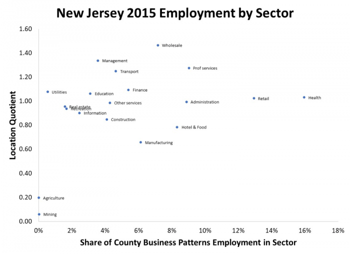
Exhibit 5 presents location quotients for so-called two-digit industries using County Business Patterns data for 2015 (see data details at the end of this post). The vertical axis is the location quotient. A value of one indicates that New Jersey’s employment in that industry is proportional to the national employment in that industry. The horizontal axis is the share of total New Jersey employment in each sector or industry.
Exhibit 5 confirms that health and retail are the biggest employers in New Jersey, since 17 percent of New Jersey workers work in health, and another 13 percent in retail. While these are large fractions of our labor force, health and retail are also major employers in the rest of the country since New Jersey location quotients for these industries are about 1. Wholesale trade is in an industry where New Jersey has about 7 percent of its labor force, but that’s a much higher fraction of our employment than the national average since the location quotient is over 1.4. Manufacturing, on the other hand, is about 6 percent of New Jersey’s employment, but since nationally manufacturing is about 9 percent of employment, the location quotient is about 0.6.
New Jersey also lagged national norms in construction, and hotel and food; we were above national norms in management, transport, and professional services. Agriculture and mining barely register in New Jersey, whether we examine labor force shares or location quotients.
The picture of County Business Patterns data presented in Exhibit 5 is informative but it is a static snapshot. A more dynamic view can be gleaned from a so-called shift share analysis, presented in Exhibit 6.
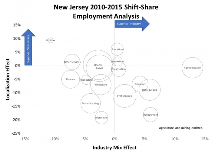
In shift-share analysis, we decompose each industry’s growth into (1) aggregate national growth, (2) growth in the national industry nationwide compared to aggregate growth, and (3) how our local version of each industry does compared to the national industry.
In Exhibit 6, the horizonal axis measures the second element, which is often called the industry mix effect. If the industry mix measure is greater than zero, it reflects that the industry grows faster than national employment as a whole. The vertical axis is the third element, which is often called the localization effect. If the localization measure is positive, our local version of the industry is performing better than the national version of the industry. The area of the circles around each industry’s label are proportional to the size of the industry in New Jersey. We’ve dropped agriculture and mining from this analysis, since the sectors are so small and the data are volatile.
The results can be interpreted as follows. First the economic growth of the reference economy it is a broad driver of the entire economy so the first element of the three calculations above it is omitted by design from Exhibit 6.
Industry mix measures the relative growth of the each industry in the national economy, i.e. are we examining “winning” or “losing” industries, generally. In 2010-2015, administration, management, hotel and food in transport were industries with positive industry mix results.
Localization results measure the growth of the each industry in the local economy (here, New Jersey) relative to the growth of the same industry in the national economy: how are our local firms doing relative to national trends? In 2010-2015, administration was a high performing category nationally; and with a localization effect near zero New Jersey, was about at that national result. But New Jersey’s performance in other strong industries such as hotel management and transportation was below par: New Jersey’s localization coefficients in these industries were negative, we performed below national norms. In fact only two midsized industries, education and utilities, had significant positive localization coefficients in New Jersey during this period.
In a number of industries New Jersey is in the dreaded Southwest quadrant of Exhibit 6: poor local performance in poorly performing industries. This doesn’t mean we don’t have any industries with superior performance. Future analysis can extend the methods of Exhibits 5 and 6 to more disaggregated data, that is to three and four-digit industry categories. We also only examined the single period, from 2010 to 2015, and results can vary for other periods. Location quotient and shift share methods are and have been shown to be good tools for learning more about the structure of the local economy, but they are imperfect at best as forecasting tools.
How Does Employment Growth Affect State Housing Markets?
How does employment growth map into housing market outcomes? Our final two exhibits present some exploratory data analysis regarding this question, relying on our state to state comparisons.
Exhibit 7 presents the long run correlation between employment growth and real (inflation-adjusted) housing price growth. The first thing to notice is the wide range of long run changes in house prices between 1980 and 2016. A number of states had negative inflation-adjusted growth. In West Virginia, Ohio, Mississippi, and Oklahoma real house prices fell by around half a percent per year over this 36 year period. At the other extreme the strongest price increase was in Washington DC with real growth of 3 percent per annum. Massachusetts Hawaii and California are not far behind with about 2.5 percent real housing price growth. New York and New Jersey were also strong performers in housing prices, with growth rates of 1.8 and 1.6 percent respectively; Connecticut real house price growth was a lower but still held healthy 0.8 percent.
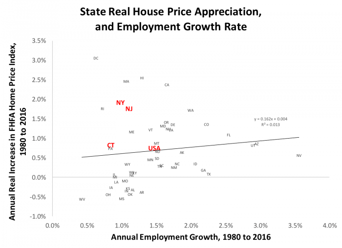
The other salient result from Exhibit 7 is that at least in the simple bivariate plot employment seems to have little effect on housing prices in the long run.
It’s worth emphasizing that the simple two-way plots are the starting point, not the final word for such analysis. Multivariate studies of housing prices generally use either employment or population are exactly the reason we noted above, that they are so strongly correlated. A number of papers listed in the references below find that either employment or population growth play more of a role in modeling prices than we see here, although generally supply-side conditions such as the physical geography of a metropolitan area and the stringency of land use and development regulations often play an even bigger role. Another area for future blog post!
Prices tell us a lot about housing markets, but not everything. Let’s finish up with a look at quantities, specifically at building permits, again state by state, over the long run.
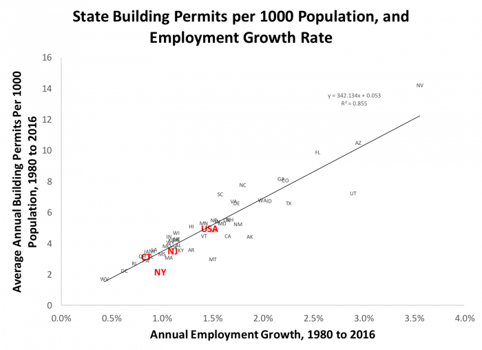
We didn’t see much correlation between housing prices and employment growth in Exhibit 7, but when we move from prices to quantities in Exhibit 8, the story is much different. Our horizontal axis, employment growth, is the same as above. The vertical axis is a normalized measure of residential building permits (units). In each year, we calculate the number of building permits issued per thousand people in the state for that year; then we average that calculation over 36 years. The correlation between employment growth and our housing permits measure is very strong (0.86).
Once again we see the tri-state areas with relatively slow employment growth, no surprise given our slow population growth in the long run, and that’s reflected in low levels of housing starts (3.5 per thousand population in New Jersey; 3.2 in Connecticut and 2.2 in New York, compared to a national average of 5.0) . Given our slow employment growth and population growth we wouldn’t want to build like Nevada or Arizona; but in research underway with Yongping Liang I am examining the relationships among prices, permits, and a range of demand side and supply side determinants; and our unit of observation is the metropolitan area, rather than the state. Preliminary results suggest that at that level we see many tri-state metropolitan areas significantly under-building, compared to the predictions of our multivariate models. When this research is complete we should have a much better understanding of the phenomena we’ve explored in this post.
The Data Geek Corner: The Many Sources of Employment Data
We talk loosely about “employment,” but there are a number of data sources. In our previous blog posts we’ve focused on the data presented by Bureau of Labor Statistics. This is the data that’s presented every month in the BLS press release so widely covered by the financial press and others. – a household survey of about 60,000 (carried out mainly by phone and mail); and an establishment or payroll survey, of about 400,000 plants and other places of business. The household survey data comes specifically from the Current Population Survey (CPS). The payroll survey, also known as the establishment survey, comes from the Current Employment Statistics (CES) survey. Both are reported on the Bureau of Labor Statistics website http://www.bls.gov.
The BLS survey 60,000 households comes out faster, and is often revised. Since it is based on household surveys, it’s the survey we rely on for unemployment and labor force participation statistics. The establishment survey of 400,000 firms provides much more detail on employment per se, e.g. by industry/sector, and for counting workers is generally more accurate.
Data for our location quotient and shift-share calculations above, as well as some of the data for other models, is taken from U.S. County Business Patterns, downloadable from http://www.census.gov. CBP tables include data on employment, number of establishments (plants), and payroll. Census collects this data and publishes it every year for each state and county.
County Business Patterns data is laid out by the North American Industry Classification System (NAICS), based on the Census of Manufactures. The NAICS system is hierarchical; where we are in the hierarchy is referred to by how many digits our codes are. We used two-digit data for our Exhibits. Three-digit data is more disaggregated than two, four more disaggregated than three, and so on. Six digit codes are the highest level of disaggregation.
The Bureau of Economic Analysis (BEA) presents annual data on employment for states, metropolitan areas, and counties, along with income and population, as well as some data on small area Gross Domestic Product. We use the BEA data in this post for Exhibits 1 through 4, and for Exhibits 7 and 8.
There are other sources, notably weekly data on unemployment claims, data on temporary workers from ManPower, and another BLS survey effort on “gross flows” or “business dynamics” about which more later). There are also other surveys, e.g. Business Dynamics survey, used to study differences between gross and net flows, etc. There are actually half a dozen sources of employment data. More details on these sources can be found in my class notes on employment.
Sources and Further Reading
DiPasquale, Denise, and William C Wheaton. “The Markets for Real Estate Assets and Space: A Conceptual Framework.” Real Estate Economics 20, no. 2 (1992): 181-98.
Hwang, Min, and John M Quigley. “Economic Fundamentals in Local Housing Markets: Evidence from Us Metropolitan Regions.” UC Berkeley: Berkeley Program on Housing and Urban Policy. Retrieved from: http://www. escholarship. org/uc/item/79d325cm (2004).
Kim, Sukkoo. “Regions, Resources, and Economic Geography: Sources of Us Regional Comparative Advantage, 1880–1987.” Regional Science and Urban Economics 29, no. 1 (1999): 1-32.
Liang, Yongping and Stephen Malpezzi. “Recent Price and Quantity Volatility in Metropolitan Housing Markets: A First Look.” In James A. Graaskamp Center for Real Estate Working Paper. Madison, WI: University of Wisconsin, 2017.
Malpezzi, Stephen. “A Simple Error Correction Model of House Prices.” [In English] Review of 1999. Journal of Housing Economics 8, no. 1 (March 1999): 27-62.
Malpezzi, Stephen and Anthony M.J. Yezer. “Modeling Regional Economies.” Teaching note, processed., 2011.
Miller, Norman G, Michael A Sklarz, and Thomas G Thibodeau. “The Impact of Interest Rates and Employment on Nominal Housing Prices.” International Real Estate Review 8, no. 1 (2005): 27-43.
Reichert, AK. “The Impact of Interest Rates, Income, and Employment Upon Regional Housing Prices.” The Journal of Real Estate Finance and Economics 3, no. 4 (1990): 373-91.
Saks, Raven E. “Job Creation and Housing Construction: Constraints on Metropolitan Area Employment Growth.” Journal of Urban Economics 64, no. 1 (2008): 178-95.
Weicher, John, and David Hartzell. “Transactions in New and Existing Homes.” The Urban Institute, 1980.
Wheaton, William C. “Real Estate” Cycles”: Some Fundamentals.” Real Estate Economics 27, no. 2 (1999): 209-11.