The impact of Hurricane Sandy on real estate prices in New York City
By Guest Blog•RErs Jason Barr, Rutgers University-Newark, and Jeffrey P. Cohen, University of Connecticut
On October 29, 2012, Hurricane Sandy made landfall in New York City. Sandy was arguably the largest and most damaging storm to hit the New York metropolitan region. 65 deaths in New York, New Jersey and Connecticut were tied to the storm. The surge level at Battery Park in lower Manhattan topped out at 13.88 feet at 9:24 pm, surpassing the old record of 10.02 feet, set by Hurricane Donna in 1960. Estimates of total losses for New York City alone were about $19 billion, and $33 billion for the entire state.
Property owners throughout the city were impacted in various ways. Those in the flooded areas obviously suffered significant damage. But perhaps, just as importantly, those properties that remained dry and were not flooded may also have been impacted, since such a storm can affect the perceptions of the safety of real estate from future surges. In fact, it was also possible that some property owners benefited from the storm because their building was safer than previously believed.
In order to understand the impact of this superstorm on New York City’s real estate values, we developed a new data set that contained roughly half a million sales that took place between January 2003 and October 2014. We collected information on virtually all types of properties, including one and two family homes, apartment buildings, and commercial structures, such as offices and stores. We combined these data with information about whether each property was flooded or not, along with other storm related variables, as discussed below.[1]
How the Storm Surge Affected Real Estate Prices
We first investigated how the storm affected real estate prices, in general, across the city. Figure 1 presents two indexes of real estate values that we created from our data set. The blue line is the index for properties that remained dry. The orange line is for those properties that were flooded by Sandy’s storm surge. The black vertical line represents the day Sandy made landfall. Before the storm, the dry and “wet” properties followed the same price movements. This is to be expected since the storm had not hit yet and there was no reason for different price movements.
The indexes show the large run up in prices from 2003 to 2006 during the housing bubble. Prices peaked in the 4th quarter of 2006 and the steadily declined from there, finally stabilizing by mid-2009. As a side note, recall that Lehman Brothers filed for bankruptcy on September 15, 2008, which then triggered a worldwide financial panic. The gray box gives the dates of the Great Recession.
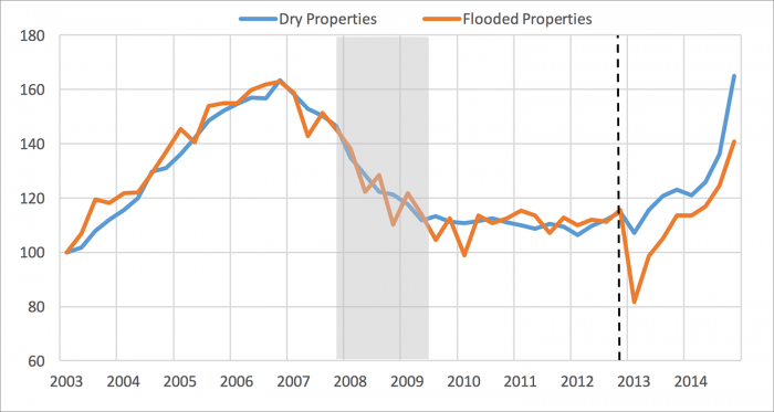
Then the storm hit and prices across the city diverged. The index shows that properties in the flooded area, on average, experienced about a 30% decline in early 2013, while there was hardly any effect in the dry area. In the two years following the storm, both areas saw rebounds from their relatively lows, but the flooded area still trailed behind.
To generate estimates of the damage affected specific properties, we performed a series of statistical analyses, where we looked at the effect of the surge on the price of individual properties, controlling for other things about the property that might affect its value, such as its usage, size, age and location.
Based on this analysis we found that, on average, one and two family homes that were flooded lost about 12 to 13% of their value after the flood. More specifically, we found that, on average, for each one foot rise in the flood waters, houses lost about an additional 3% more in value.[2] Note that the average flooded house saw about four feet of flooding. On average, apartment buildings lost about 10% of value from the storm, with about a 6% drop in price for each foot rise in the flood. Finally, we found that commercial properties, on average, lost about 12% of their value from the storm, with about an 8% loss per foot of flooding
Storm Perceptions and Property Prices
The next question we were interested in investigating was the degree to which the storm affected perceptions about the likelihood of future flooding. To most New Yorkers, the severity of the hurricane came as a complete surprise. Of course, summer storms, including hurricanes, in the New York metropolitan region are not uncommon, as well as the flooding that accompanies them.
To help mitigate against the loss from flooding in communities across the country, in 1968, Congress created the National Flood Insurance Program (NFIP) to help provide a means for property owners to financially protect themselves. The NFIP offers flood insurance to homeowners, renters, and business owners if their respective town or city participates in the NFIP.
The Federal Emergency Management Agency (FEMA) partners with states and communities through the Risk Mapping, Assessment, and Planning (Risk MAP) program to identify flood hazards and assess flood risks. These data are incorporated into flood maps, known as Flood Insurance Rate Maps (FIRMs), which provide the basis for community floodplain management regulations and flood insurance requirements. Most commonly used for insurance purposes are the 100-year floodplain maps, which are areas designated to have a 1% chance of being inundated each year.
The maps thus serve as a publicly available assessment of the likelihood of a property being flooded. In addition, for those outside the floodplain, the distance to the plain could presumably be used to provide information about the relative flood safety of the neighborhood. Being 20 feet from a floodplain suggests more risk than one 2,000 feet away. Thus the location of the floodplain could be used as a kind of marker for people’s expectations about the likelihood of being flooded.
When Sandy hit, property owners could then update their beliefs about the future by comparing where the Sandy flood zone ended relative to the border of the FEMA floodplain zone. Based on this, we were able to compare the two and get a sense of how the storm influenced people’s expectations and the value of real estate across the city.
To the end, we measured for each property that remained dry the closest distance to the Sandy inundation zone minus the distance to the FEMA floodplain. For example, say a house was 100 feet away from the Sandy, but the FEMA floodplain was 200 feet away. This meant that Sandy was closer to the house. We call this a negative shock. On the other hand, if the FEMA floodplain was 200 feet but the Sandy inundation boundary was 300 feet this represented a “positive shock.” We hypothesized a positive relationship, on average, between the Sandy-FEMA floodplain distance and the value of a property.
Again, the key point is that since all that properties remained dry, any price change that came about because of the storm reflected a change in perceptions only, and thus a reallocation of value away from the negatively shocked areas to the positively shock ones.
Our statistical analysis confirmed our hypothesis. For one and two family homes, we found that, on average, a positive shock of half a mile increased house prices by 5% (and decreased them by 5% for negative shocks). For apartment buildings, the shock effect was about 8% per mile, for commercial properties about 17% per mile.
These estimates, however, give us an average value for each property type, but neighborhoods across the five boroughs were quite diverse, varying from blocks of dense apartment buildings to commercial districts to leafy suburban-style single-family homes and everything in between. We could imagine that across the city there were different reactions to how the market valued these “shocks.”
In order to investigate in more detail how specific properties and neighborhoods were affected, we employed a statistical method that allowed us to estimate the size of the reaction for each property. In this case, we focused on properties that had more than one sale over the time period and where one sale happened before the storm and the other occurred after it. Doing this helped us better identify how a surge shock affected market values by removing other factors that might have caused prices to change.
Figures 2 – 4 present our estimates for the “shock values” that came from the storm. In particular, the maps show the estimated changes in properties values. The blue dots are structures that had an increase in value, while the red dots are those with a decrease. For simplicity, we divided the estimated price changes into four categories—a loss of greater than 5% (dark red), a loss between 5 and 0% (light red), a gain between 0 and 5% (light blue) and a gain greater than 5% (dark blue).
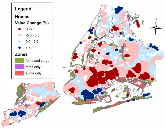
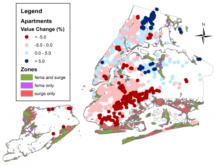
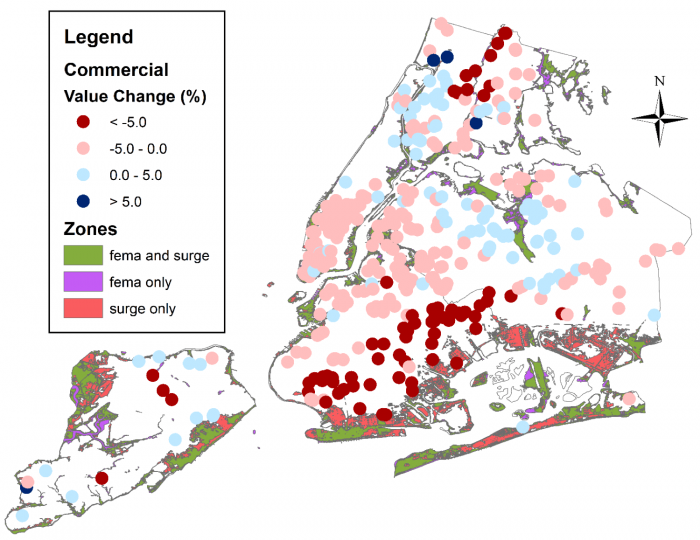
In conclusion, it is important to realize that when a terrible storm hits a city, it affects the value of real estate in many ways. Clearly, Sandy’s storm surge had a severe impact on property prices because of the damage caused by the floodwaters. However, the storm also changed perceptions about the relative safety of each structure, even for those that experienced no flooding all. Our statistical analysis suggests a significant re-allocation of values across the city based on the location of the surge relative to the FEMA-created Flood Insurance Rate Maps. In particular, several neighborhoods in southeastern Brooklyn experienced price drops, even though they were not flooded; on the other hand, many properties scattered throughout the city actually saw an increase in value after the storm.
[1] More detailed information about the data and statistical analyses can be found in Barr, J., Cohen, J. and Kim, E. (2017). “Storm Surges, Informational Shocks, and the Price of Urban Real Estate: The Case of Hurricane Sandy.” Unpublished manuscript.
[2] It is important to note that value here is determined by market sales. It might be the case that a property was damage so badly that it was torn down or never sold after the storm; it is thus possible that our data set only contains information and the least damaged properties, and our estimates of the effect of the storm might be lower than the true amount.