Why the Fed is poised to raise interest rates
Executive Summary: The Federal Reserve looks poised to raise rates in June. Their decision is based on the fact that, despite relatively sluggish GDP growth, the labor market looks to be closing in on full employment. Beyond June members of the Fed’s interest rate setting Federal Open Market Committee (FOMC) see different risks. One group leans on a relationship known as the Phillips Curve which says that falling unemployment could lead to high inflation to argue for continued policy tightening. Another group is looking at actual inflation and inflation expectations which are moving in the wrong direction to argue for a possibly more cautious approach. The experiences of our developed market counterparts in Japan and Europe potentially suggest caution may be warranted.
Financial markets are pricing with near certainty that the Federal Reserve will raise its benchmark policy interest rate when it meets this month and public comments from members of the Federal Reserve Open Market Committee (FOMC) have confirmed that higher rates are indeed a likely outcome of their deliberations. What is the Fed hoping to achieve with this adjustment in policy? The simple answer is that the US economy appears to be closing in on the Fed’s mandate under the Federal Reserve Act to set monetary policy to achieve “maximum employment, stable prices, and moderate long-term interest rates”. In practical terms the Fed wants inflation to center on 2% and the unemployment rate to fall to, or slightly below the Fed’s estimate of the unemployment rate that is sustainable in the longer-run. Given that monetary policy decisions affect the economy with a lag, recent progress on its goals makes the FOMC want to move policy away from an accommodative stance whereby monetary policy is stimulating above trend economic growth to a more neutral setting. In simpler terms, the Fed wants to slow the US economy down.
Taking the Punchbowl Away from An Already Mellow Party
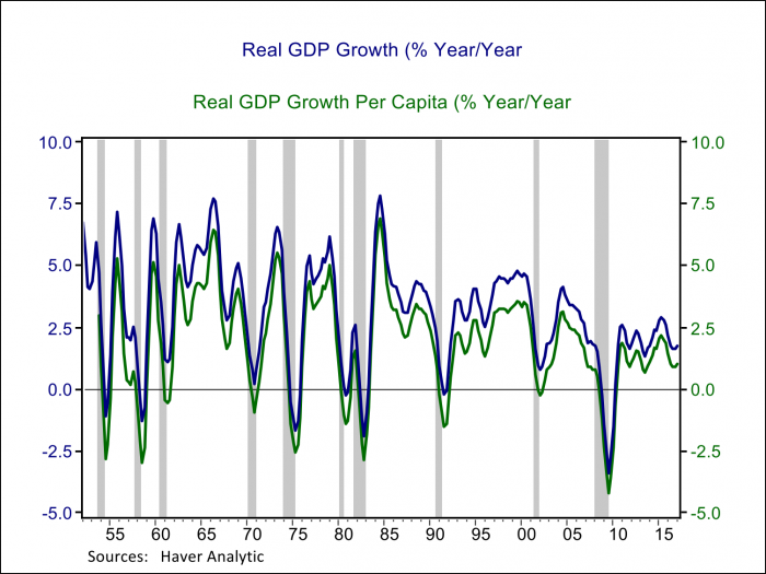
It may come as a surprise that the Fed wants to cool off economic growth when we have been laboring through a persistently sluggish recovery by historical standards. Chart One illustrates that the current recovery is one of the slowest, but also one of the longest in the post-war period. GDP growth has averaged 1.6% so far in the current recovery as compared to an average annual pace of 2.5% in the previous recovery and 3.8% in the lengthy 1990s expansion, on a per capita basis growth has averaged just 0.8% as compared to 1.5% and 2.5%, respectively in the prior cycles. Some of the weaker performance reflects slower growth in labor productivity which depends on factors including education, investment and innovation, factors over which the Federal Reserve has no control. Whether the economy is growing fast or slow in a cyclical sense relevant for monetary policy depends on the economy’s growth potential, the speed at which the economy can growth without increasing or decreasing unemployment.
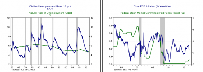
The Fed relies on the unemployment rate to determine whether the economy is growing above or below it’s potential. Chart Two below illustrates that economic growth below potential in a recession leads the unemployment rate to jump above its longer-term natural rate and a recovery features above trend growth, helped along by accommodative monetary policy, that then works to bring the unemployment rate down. At the peak of prior business cycles, the unemployment rate would fall below the Congressional Budget Office’s estimate of the longer run natural rate, sometimes for years. The US unemployment rate fell below the CBO’s 4.7% estimate of the natural rate this year and stood at 4.4% in April. Despite sluggish GDP growth the unemployment rate is signaling that the economy has been growing above its potential and has now essentially met the Fed’s employment mandate.
Things aren’t going quite as well on the other side of the Fed’s mandate which is to achieve its 2% inflation target in a sustainable and symmetric fashion. The Fed’s preferred inflation gauge is the personal consumption expenditure price index excluding food and energy, also called the core PCE price index, as it best captures consumer inflation trends. The core PCE price index is plotted alongside the Fed’s policy interest rate in the right panel of Chart Two. The Fed had good success last business cycle with core inflation averaging 2% over the cycle; it was below target following the 2001 recession but then rose to just above 2% during the latter stages of the expansion. In the current cycle core inflation spent a few months around 2% in 2011-2012, but it has been persistently below target for most of the recovery and has fallen from 1.8% y/y to 1.5% this year.
The Fed’s mandates for maximum employment and 2% inflation have traditionally been tied together through a relationship known as the Phillips Curve. The Phillips Curve is an empirical inverse relationship between wage growth and unemployment first documented by A. W. H. Phillips for the United Kingdom using data from 1861 to 1957. It is intuitive that a tight labor market will produce faster wage growth that in turn supports a rise in the general price level. The empirical relationship was most evident and had its greatest policy influence in the US in the 1960s but has struggled for relevancy since. Even back in the 1960s Milton Friedman was a critic of the notion that the Phillips Curve relationship represented anything more than a transitory, cyclical tradeoff, but it was the inflation of the 1970s and the subsequent disinflation in the 1990s and beyond that drove home the point that many other factors influence inflation dynamics other than unemployment.
The Double-Edged Sword of Conquering Inflation Expectations
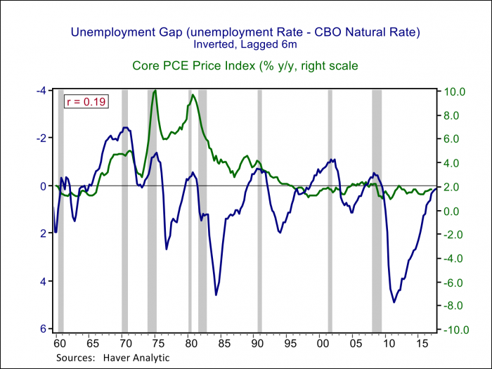
The Phillips Curve has been breaking down empirically for the past four decades. Chart Three below plots the inverse of the gap between the unemployment rate and the CBO’s estimate of long-run potential against core PCE inflation. The tight relationship between an unemployment rate below the natural rate and core inflation is evident in the 1960s and early 1970s. Starting in the mid-1970s inflation rose persistently, and while inflation ebbed and flowed with gyrations in the unemployment rate, the level was disruptively high. It took an extended and painful period of unemployment above the natural rate in the late 1970s and early 1980s to achieve a lasting disinflation. Former Fed Chair Paul Volcker is widely given credit for slaying the inflation dragon in part by proving the Fed’s inflation-fighting credibility and thereby anchoring the inflation expectations of firms, workers, and investors; if people expect inflation to remain low they will set prices and negotiate wages in a way that reflects and reinforces stable prices. The Phillips Curve relationship between inflation and the unemployment rate has flattened out considerably in the past three business cycles and inflation expectations have become the focus of policy makers in achieving their inflation target.
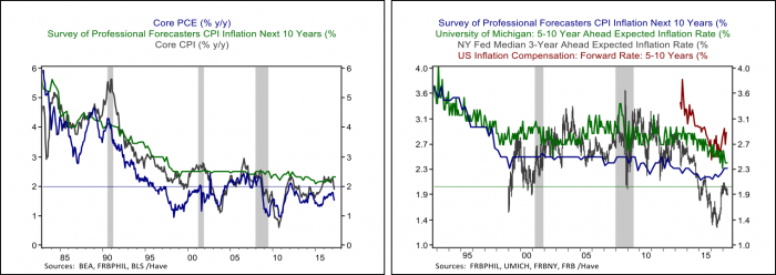
Central bankers widely credit stable inflation expectations in driving what can only be described as a remarkable stability in core inflation trends across economic environments as disparate as the boom of the late 1990s and the depths of the Great Recession. However, the Fed may have achieved more than the desired degree of success with inflation expectations now potentially too low to achieve core inflation centered on 2%. The left panel in Chart Four illustrates one measure of longer-term inflation expectations from the Survey of Professional Forecasters against both the Fed’s preferred gauge of core PCE inflation as well as core inflation from the Consumer Price Index. The conquest of both expectations and high and volatile inflation is clearly evident. Expectations were solidly anchored at 2.5% between the mid-1990s and the Great Recession but have become more variable and averaged a bit lower than 2.5% in the current cycle, potentially reflecting the persistent underperformance of core inflation to expectations. The right panel of Chart Four shows other measures of inflation expectations, including those from consumer surveys conducted by the New York Fed and the University of Michigan, as well as inflation compensation from the inflation-indexed Treasury market. All measures of inflation expectations display downward drift in the current cycle, which in turn helps explain inflation under performance; if firms and consumers don’t expect much inflation they will set prices and negotiate wages accordingly.
Despite the weak empirical support for the Phillips Curve, several Fed speakers continue to use the relationship in advocating for tighter monetary policy while others place more emphasis on the continued shortfall in inflation and downward drift in measures of inflation expectations. In a recent interview New York Fed President William Dudley noted that if the unemployment rate drifted much lower “you’d probably start to have an inflation problem”. Boston Fed President Eric Rosengren also stated in a recent speech that continued declines in the unemployment rate “would likely cause increased pressure on wages and prices, and signal an economy on a pace exceeding its sustainable level.” Others on the Committee agree that the Fed should move in the direction of tighter policy given an economy close to full employment, but are more concerned about the shortfall in inflation. Fed Governor Lael Brainard recently noted that “with the Phillips curve appearing to be a less reliable guidepost than it has been in the past, the anchoring role of inflation expectations remains critically important.” In a similar vein Chicago Fed President Charles Evans recently worried that “the public makes inferences regarding our inflation target based on past performance and not just on words. When they see inflation below 2 percent for eight-plus years, they…would likely push down their expectations for average inflation over the longer run, making it all the more difficult for the central bank to achieve its inflation objective.”
Is the Economy on the Verge of Overheating or Getting Stuck in a Low Inflation Trap, and Does it Matter?
Achieving the Fed’s inflation target is more important than ever. Most economists currently put the economy’s potential growth rate below 2% reflecting an aging population and a decline in productivity growth. Low potential growth implies lower equilibrium interest rates and a greater likelihood that the Fed will find itself cutting interest rates back to zero in the next recession. If the Fed finds itself back at the zero lower bound on interest rates it could also find itself back in the business of balance sheet expansion and unconventional monetary policy, which is arguably harder to calibrate and comes with possibly undesirable side effects. Achieving higher rates in the future and minimizing the chances monetary policy ends up back at the zero lower bound on interest rates may require greater patience on interest rate policy now.
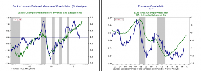
There are important examples abroad to give the Fed some pause on placing too much faith in the Phillips Curve. The relationship between core inflation and the unemployment rate are plotted for Japan and the Eurozone in Chart Five below. At 2.8% the Japanese unemployment rate is well below anyone’s estimate of the natural rate yet core inflation just fell back into negative territory. Europe is similarly grappling with a recovery and labor market that are gaining traction but core inflation waffling below 1%. Central banks in both areas are well stuck at or below zero on policy rates and are completely reliant on quantitative easing to set monetary policy. It may be difficult for policy makers who cut their teeth in an era where high inflation was the beast to be tamed to adjust to new global realities of low inflation, but the signals from inflation and inflation expectations are flashing warning signs that probably should be taken into account.
