
Growth, stagnation or decline: why it could break any way
This post follows up on our previous blog that provided an overview of the measurement of residential rents and values, and discussed recent trends in rents. This Part II focuses on house values, or the asset price of housing.
A number of basic data sources for house price indexes are described. Simple presentations of national data put recent trends into context. While all these indexes give qualitatively similar results in the boom and the bust, we will see below that the magnitude of measured price changes varies a lot by source. This variation is substantial even before we examine subnational data from states, metropolitan areas and the like. We will see even more variation in two weeks, when we extend this study by looking at house price indexes in different states and metropolitan areas, with a focus on the Tri-State area.
Introduction
Housing prices are important because they are the price of one of life’s fundamental necessities, and a key driver of affordability. Housing prices are a big deal. Today’s Rutgers real estate undergrad might have been in the fifth grade, give or take a year, when circa July 2006, booming U.S. house prices collapsed. Depending on the source, national average prices fell 20-40 percent in real terms before rebounding in 2012. The declines in more volatile major markets found in states like New York, California, Florida and Nevada were substantially larger; Los Angeles prices fell in half, by some measures, and Las Vegas by two-thirds. The impact on mortgage markets and their derivative securities was severe, leading to several traditional bank runs (depositors clamoring for their funds back) as well as a much more severe run on short term money markets. In September 2008 the collapse of Lehman Brothers heralded a massive global financial shock.
The U.S. entered recession in December 2007. The recession was the deepest since the 1930s Great Depression, with a 5 percent decline in real GDP. Keep the Great Recession in perspective: a 5 percent decline in output is bad news, but GDP fell by a third in the Great Depression, from a much lower per capita level, with little in the way of a safety net. In the event, the recovery began in June 2009, but while the post “Great Recession” recovery has been long, it has been shallow, with growth rates roughly half of that normally observed in expansions.
If you are reading the Rutgers Real Estate Blog you are already deeply interested in housing prices for their own sake. In addition, as many macroeconomists including our friends Julia Coronado and Morris Davis have repeatedly emphasized, housing prices touch us all; first and foremost because that’s where we live, but also because the housing market is one of the principal channels driving cycles in the larger economy. There’s a reason the Federal Reserve, other central banks, and institutions like the IMF and the Bank for International Settlements pay a lot of attention to housing prices.
The causes of the Great Financial Crisis and Great Recession were varied and layered and complicated, as now hundreds if not thousands of books, papers and blog posts have testified. That does not mean that every cause should be given equal weight. First and foremost was the early 2000s boom in U.S. house prices. Other causes, such as interest rates, land-use regulation, subprime lending, poor underwriting, high loan-to-value ratios, and so on, were sometimes deeper causes of house price rises; sometimes effects of rising house prices; sometimes both. If, somehow, despite these other causes, housing prices had not boomed, had not later experienced the inevitable post-boom bust, then the crisis would not have occurred; or at least would have taken on a very different and less severe character and timeline.
Enough motivation. Let’s look at some housing prices.
Which Index? A Tangled Skein of Estimates
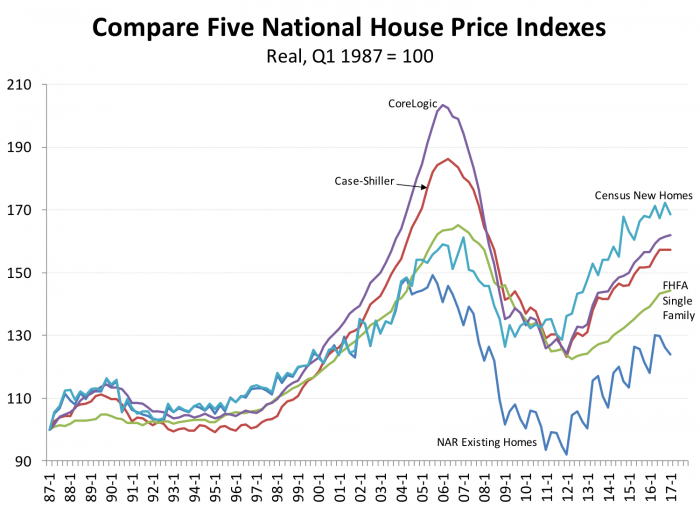
Measuring house prices well is difficult, as our previous discussion of hedonic models, repeat sales indexes and the like indicated. Exhibit 1 presents several well-known house price indexes over the past 30 years. Some indicators are quarterly, some are monthly. In the Exhibit, we’ve averaged the monthly indicators over quarters. All indexes are deflated by the GDP deflator.
It’s apparent from the Exhibit that there was a boom in the late 1990s and early 2000’s, peaking around 2006 or so, followed by a bust that turns around circa 2010. But it’s also obvious that the measured amplitudes of the cycle are very different depending on the index used; the dates of turning points vary slightly by index.
First we’ll very briefly discuss the sources and methods of our five indexes, providing links for further details and so interested readers can obtain more complete data. Then we’ll discuss some of the key results.
The National Association of Realtors publish the most widely tracked housing price indexes, the median sales prices of existing homes, nationally and for about 120 metropolitan areas. They also have data on time on market, inventories, and so on. The National Association of Realtors median sales price is not, of course a true asset price at all, but is a median residential value. Based on single-family existing home sales, national data are available back to 1968. The data are monthly and are not seasonally adjusted. Hendershot and Thibodeau find a bias of about 1 percent per annum due to the lack of hedonic or other quality adjustment. Starting in 2005, NAR also began to present data for cooperatives and condominiums.
Census provides three house price indexes for newly built units: (1) median asking price for units under construction; (2) median and average price for units newly sold; and (3) average price for units newly sold, holding size and quality constant using a simple hedonic regression model. Census focuses on new construction because their ultimate focus is measuring the value of new residential construction, a major component and hence GDP. These Census prices are available as both index numbers and as dollar values; i.e. they measure both levels and changes in new home values. There are differences, but broadly these Census new construction measures are complementary to NAR’s data on existing homes.
The Federal Housing Finance Agency is the regulator of Fannie Mae and Freddie Mac so they can obtain housing data from both agencies and combine them. FHFA indexes are available for metropolitan areas and more recently small areas including ZIP Codes. The data are available in some of the larger metropolitan areas back to 1975. Since 1990 the panel has grown to incorporate about 400 metropolitan areas.
Because the FHFA data set is based on Fannie and Freddie data even though it is large, it omits so-called jumbo mortgages above the conforming loan limit for Fannie and Freddie which is currently $424,100 in most markets. There are 238 counties (out of 3,141) that have higher limits, up to $721,050 in Honolulu. Most of these are in or near New York, Boston, DC, Denver, California, Alaska, Hawaii, plus a few in expensive resort areas like the Grand Tetons. Loans above these limits made by private sector lenders not participating in GSE programs are called “jumbo” loans.
FHFA data also exclude data from Veterans Administration and Federal Housing Association loans, and most so-called Alt-A and subprime data (which are “private label”). Taking these exclusions together, FHFA systematically omits data from both the top and bottom of the market.
Initially FHFA price indexes used data from all Fannie and Freddie transactions many of which were appraisals reported as part of a refinance transaction. Such appraisals are not unbiased estimates of market prices, as studies have confirmed. In recent years FHFA has supplemented their traditional index with a purchase-only house price index, and also an extended data index which incorporates data from outside the FHFA Fannie and Freddie universe to include some jumbo and bottom of the market sales as well.
Unlike the FHFA’s main index, the all-transaction home price index excludes refinancing contracts and thus eliminates refinancing bias. Research has shown that during times when prices are falling refinancing bias tends to push up measure prices and during periods of rising prices refinancing bias tends to push down measure prices because of the lag between current prices and previously assessed home values. While the purchase only house price index has some advantages, it does reduce the available sample size so the coverage is more limited than the all transaction index. The monthly purchase only index covers only the US and nine Census divisions. The quarterly purchase only index covers states and the largest 25 metropolitan areas and only since 1991.
The Case-Shiller index was originated by economists Karl Case and Robert Shiller as a repeat sales Index, following the method of Bailey Muth and Nourse, adding some innovations in the weights given to different transactions. Case-Shiller scour publicly available data sources and have a more representative sample in many markets than FHFA, but their coverage is weaker in some states which limit the public availability of some housing data.
State laws regarding disclosure of sales prices and other details of real estate transactions change over time, but a recent study by Idaho’s State Tax Commission reported by McDonald (2007) classified Alaska, Idaho, Louisiana, Mississippi, Missouri, Texas and Utah as non-disclosure states (although St Louis and other counties in Missouri have decided to disclose); Arkansas, Delaware, North Carolina, Oklahoma, Rhode Island and Tennessee also failed to disclosed sales prices, but disclose taxes due on sale so calculating sales price merely requires dividing the tax amount by the known rate.
Both Case Shiller and FHFA need to filter out units that have changed markedly. For example a room addition or other upgrade will impart an upward bias into the index, if not controlled. Depreciation must be accounted for to avoid a bias in the other direction; a unit which hasn’t physically changed, even if well-maintained, will tend to depreciate by perhaps 0.5 percent or more per year (Malpezzi Ozanne and Thibodeau) and so these indexes need to make a depreciation adjustment.
Case-Shiller computes a property index for some 400 locations, but since the data are proprietary, they only provide public data for 20 Metropolitan markets beginning in 1987. The data are monthly and the internal weights down weights sales pairs with long intervals between sales. Case-Shiller indexes are based on public records, so the coverage is not as good in non-disclosure states. Case-Shiller indexes were initially provided by a firm started by the two eponymous economists with a former student, Case-Shiller-Weiss. They later sold their business to Standard & Poor’s and more recently the Case-Shiller indexes have been acquired by CoreLogic.
CoreLogic is another source of proprietary housing price data, although they release their national indexes publicly with a slight lag. CoreLogic produces repeat sales indexes back to 1976 for some locations, and now covers 7,400 ZIP Codes, 1,300 counties, the 50 states, and most Core-Based Statistical Areas (metropolitan and micropolitan areas). The indexes are available for several tiers, based on property type, price, time between sales, loan type, and whether or not sales are classified as distressed. Tiering by price can be problematic, since choosing samples based on a dependent variable can be a source of serious bias. We use the single-family combined tier in our examples.
Recently CoreLogic has purchased the repeat-sales Case-Shiller index business from Price Waterhouse, and has also purchased FNC’s Residential Price Index, a hedonic-based price index, to augment their data offerings.
There are other data providers not included here. Probably the best known is Zillow, which is not included in Exhibit 1 because their data don’t go back far enough. Zillow is an online real estate services provider which scours the web for public data, mostly from property tax assessment records. Zillow uses a proprietary set of statistical algorithms to compute house price estimates that they refer to as Zestimates; predicted values are estimated for each individual unit, along with standard errors of the estimates. Zillow also provides house price indexes based on median Zestimates, nationally and by metropolitan area back to 1997.
Zillow indexes can be revised and reported frequently, even daily – although it’s not clear how much new information is actually incorporated in each day’s run of the data, since very few units have new sales price or assessment data reported on any given day.
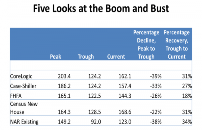
Exhibit 2 puts some numbers on the peaks and troughs represented graphically in Exhibit 1. All 5 indexes start in 1987 at 100, of course. Starting circa 1996, all indexes begin to show rapid rates of increase. By the 2006 peak, real housing prices have doubled according to CoreLogic. At the other extreme, they’ve “only” risen by about 50 percent, according to the NAR medians. The other indexes rise between 2/3 and a bit under 90 percent; significant variation, but all showing the same qualitative pattern.
The measured declines from peak to trough are similarly large, and similarly variable in magnitude. Generally, the higher the boom, the bigger the bust, with one notable exception: the NAR index was the smallest boom but it more or less matches boom-leader CoreLogic with the biggest bust.
Since the market turned up again, all five indexes show similar growth patterns; the FHFA lags in magnitude (up 18 percent) while most are up around 30 percent, more or less.
Remember that a big percentage change in one direction is not perfectly offset by the same percentage change in the other direction. If an index or value falls by 50% – is cut in half – a 50% bounce back from the trough only gets you half the way back. You have to double the value at the new trough to get back to the old peak after a 50 percent decline. Of course this is just arithmetic. I’m not arguing we want to be back at the 2006 peak in all markets, at least not as of 2017. We’ll have more to say about where we would like to be in a future most, after some more serious econometric work.
Another Look at Trend: Housing Prices in the Very Long Run?
In our review of house prices above, the best data – based on either repeat sales or hedonics – only go back as far as 1975, although some averages and medians do go back further. Studies such as Malpezzi and MacLennan (2001), Davis et al. (2008) and Shiller (2015) have delved into pre-1975 prices. There is a clear tradeoff, in that the farther back we go, the less reliable our housing price data. In the event, nothing in these studies of longer run prices is basically inconsistent with the basic arguments in this paper about the effects of booms and busts. Exhibit 3 presents data from the best known of these studies, Robert Shiller’s book Irrational Exuberance.
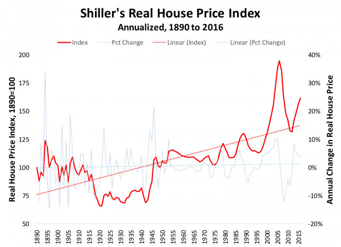
Is it better to be lucky or to be good? The short answer is, yes. Yale economist and Nobel prize winner Robert Shiller has been both. He modestly acknowledges a little luck along with a lot of ability and hard work. Already well-known among economists and finance professionals for his pathbreaking work on excess volatility in equity markets, and among housing economists for his work on housing prices with the late Karl (Chip) Case, in the late 1990s Shiller decided to write a book for a larger audience. His analysis had been showing that the late 90s tech stocks were highly overvalued compared to fundamentals. That was the good part. The book hit the market in summer 2000, almost the week the stock market bubble burst. That timing, as Bob is always quick to note, was the lucky part. It’s easier to see when markets are getting out of line with fundamentals, than to pick the turning points
The first edition of Irrational Exuberance was a resounding success partly due to that lucky timing as well as being carefully researched and well-written. As the 2000’s progressed Shiller and Case became more and more concerned about housing prices relative to fundamentals. Not content to rest on his laurels from his first edition, Shiller wrote a second edition, focusing this time on housing markets, based on his research on his own and with Case. Exhibit 3 is based on that work, updated. When the second edition of Irrational Exuberance came out in 2005 we were not quite at the 2006 peak, but still the book was prescient.
In passing, we can note that the third edition of Irrational Exuberance came out in 2015; this time Shiller focuses on the possibility of a bubble in the bond market, about which we won’t say more today.
Several authors including Davis et al. and Davis and Palumbo have critiqued Shiller’s work, including providing alternative house price indexes that show more of a boom in the 1970s and more of a subsequent bust. But long run studies by Shiller, Davis and Palumbo, Malpezzi and MacLennan and others all come to a qualitatively similar conclusion. Post-World War II, and probably even longer run, real average U.S. housing prices grow by something between zero and half a percent per year. Much faster real house price growth over any long run is likely not sustainable. One does not need a formal model, just an understanding of the process of exponential growth to recognize that if you take something which is a large part of the economy (housing is half the tangible capital stock) and grow it at several percent real per year or more over long periods, at some point that growth has to slow unless we are willing to contemplate a world where housing asymptotically becomes the entire economy. That’s a world none of us can understand.
That insight leads us to the first of several simple analyses of house prices, univariate “models” based on simple ratios that we can examine graphically. Later in the year, we’ll examine more sophisticated econometric models, but it’s good to start with simple exploratory data analyses.
Trend Analysis of “Average” U.S. House Prices
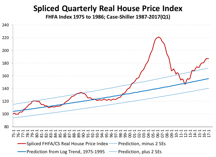
Exhibit 4 shows average real U.S. house prices over the past 40 years; while the older data used by Shiller and other studies cited above go back further, we prefer to limit ourselves to more reliable data for this exercise. The data splice the best recent national price indexes, from Case Shiller, with earlier data from the Federal Housing Finance Agency. The index is based Q1 1975=100, and are deflated using the GDP deflator. The solid blue line is the trend during this period, extended out of sample; the dotted lines show the trend plus and minus two standard errors. The Figure is purely descriptive. But the picture helps set the stage for other analysis.
From 1975 to 1995, according to this data, average U.S. prices grew at about 0.4 percent per annum (inflation adjusted). During the boom, 1996 through 2006, real prices grew by about 7 percent per annum. But “every housing boom is followed by something else that starts with the letter ‘B,’” as long run analyses have repeatedly demonstrated (Ambrose et al. 2013; Malpezzi and Maclennan 2001; Shiller 2015).
After the 2006 bust, the U.S. housing market bottomed in 2012. Since then average housing prices have shown a strong recovery, and have now once more broken the two-standard error barrier that preceded modest downturns circa 1979 and 1990. The annual real growth rate over this 3 year period is back up to 6 percent. While clearly less of a boom than we experienced in the early 2000s – 4.5 years of 6 percent growth is different from a decade of 7 percent growth – a number of housing market observers have begun to discuss the possibility of a new “bubble” (Kusisto 2017; Olick 2017 and other articles listed at the end of this post). Are we in a bubble?
That brings up the question, what’s a bubble? There are several possible definitions of a “bubble”; some are connected to adaptive expectations, e.g. when rapidly rising prices today give rise to expectations of future price rises. The central problem is that to test for a bubble, you need to know what the fundamentals are. Critics of bubbles point out we never know these for sure. Any test of a “bubble” is really two tests, of a departure from fundamentals, and whether we have the true fundamentals; and these can’t be sorted out. Others say, OK, but that’s true for any econometric model. We have to put a stake in the ground somewhere to make progress. No model or test is perfect. For the record, I’m in this last camp. Exhibit 4 is in no way proof of a bubble, but it’s a reason to begin to study the issue more carefully.
Beyond Trends, Before Econometrics: Exploring Two Univariate “Models” and Housing Prices
Two covariates that are often examined along with house prices are incomes, and rents. Put simply, analysts that examine price-to-income ratios are getting a rough and ready look at one of the determinants of “affordability” (Malpezzi 2016). Analysts that examine rent-to-price ratios are positing a relationship between housing consumption and housing investment. Two papers by Gallin and a correction to Gallin’s work by Liang and Malpezzi have reminded us that these two relationships are very long run; they can’t tell us anything definitive about short run relationships. So anything we see in these data are exploratory and indicative, at best.
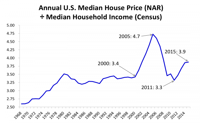
Exhibit 5 presents a simple ratio between the NAR house price median, and median household income. Data are annual and end at 2015, since 2016 household income data are not yet available. It’s hard to see any clear evidence of a simple mean reversion or average price-to-income ratio. Nevertheless, it’s not a surprise to see that the price-to-income was at a peak just before the 2006 crash. Nor is it a surprise that it’s on the rise again.
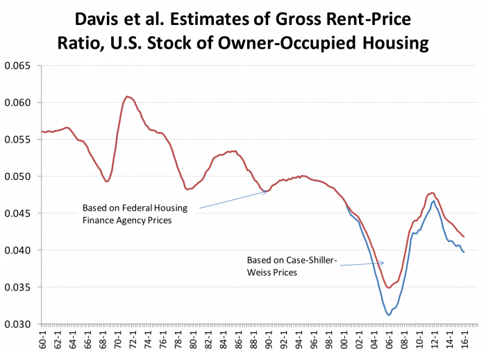
Exhibit 6 presents data on another popular univariate exploration, the rent-to-price ratio. This has been on a downward trend since the 1960s, although it’s clear that trend can’t continue indefinitely, unless one is willing to contemplate either free rents, or infinitely large house prices. Once again, the ratio is falling, though not yet at the level we saw during the peak of the boom.
Income and Mortgage Rates Combined in A Simple "Affordability" Index
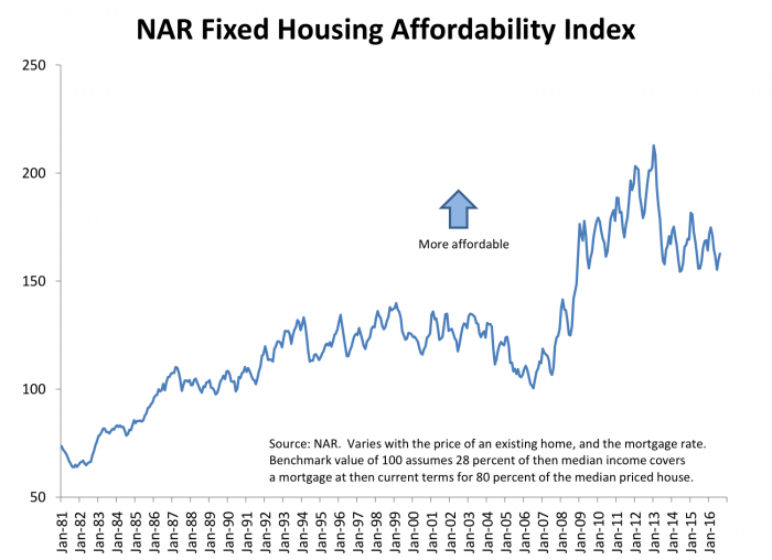
Our final price ratio today is one familiar to every REALTOR: the NAR Housing Affordability Index (HAI), presented in Exhibit 7. NAR’s monthly Housing Affordability Index is calculated as follows. A value of 100 means that a median income household has exactly enough income to qualify for a mortgage on a median-priced home, assuming an old underwriting rule of thumb that a household can spend at most 28 percent of their income on mortgage payment and property taxes. The calculation assumes a 20 percent downpayment, and a fixed-rate mortgage at then-current rates. An index above 100 signifies that a household earning the median income has more than enough income to qualify; as the index falls below 100, affordability decreases.
Taking NAR’s measure at face value, Exhibit 7 shows that affordability fell a bit during the early 2000s housing boom, as rapidly rising prices outweighed reasonable income growth. NAR affordability increased rapidly during the bust; income was weak but falling prices and low interest rates drove the index, and measured affordability, up. While recent affordability is lower than the peak, the HAI values are still very favorable in historical context. The obvious fly in the ointment is that the NAR index does not incorporate mortgage availability, i.e. we assume that the interest rate alone captures financial conditions, which is of course problematic, as we showed in a previous post.
The Bottom Line
There are many sources of housing price data available; we’ve examined five of the most common, at the national level. They don’t track each other exactly, yielding different estimates of the size of the recent boom and bust – and rebound – in the U.S. housing market. But qualitatively, they tell the same story.
Simple analyses of the national trend, and of prices relative to rents, relative to incomes, and in a widely used simple measure of “affordability” suggest that house prices, while nowhere near the dangerous levels of 2005 and 2006, are high by those standards. Careful attention is warranted, which we’ll extend in two weeks when we break out house prices by state and metropolitan area, which will give us further insights into the potential for future growth, stagnation, or decline in housing markets.
Examples of Recent News Stories Pro and Con a Housing “Bubble”
Chiu, Jeff. San Francisco’s Housing Bubble has Forced People to Move Deep Inland. Axios, August 18, 2017. https://www.axios.com/san-franciscos-housing-bubble-has-forced-people-to-move-deep-inland-2474375925.html
DeMay, Daniel. Is the Seattle housing bubble about to pop? Seattle Post-Intelligencer, August 15, 2017, http://www.seattlepi.com/local/article/Survey-says-housing-bubble-looms-reality-11818179.php
Kusisto, Laura. Rising Home Prices Raise Concerns of Overheating: Dearth of new construction and strong demand from buyers are pushing up prices. Wall Street Journal, April 26, 2017. https://www.wsj.com/article_email/rising-home-prices-raise-concerns-of-overheating-1493128355-lMyQjAxMTE3MTI2NzAyNzczWj/
Lynn, Kathleen. Homes Under $400,000 in Short Supply. NorthJersey.com, March 17, 2017. http://www.northjersey.com/story/money/2017/03/17/homes-under-400000-short-supply/98005878/
Olick, Diana. Four major US cities ring housing bubble alarm. Realty Check, August 1, 2017. https://www.cnbc.com/2017/08/01/four-major-us-cities-ring-housing-bubble-alarm.html
Petenko, Rein. 10 hottest and 10 coldest real estate markets in N.J. NJ.com, April 12, 2017. http://www.nj.com/news/index.ssf/2017/04/the_10_hottest_and_coldest_real_estate_markets_in_nj.html
Ramirez, Kelsey. Charts Ten-X: We Are Definitely Not in a Housing Bubble – Inflation-adjusted Home Prices Only at 2004 Levels. HousingWire, August 11, 2017. https://www.housingwire.com/articles/40988-charts-ten-x-we-are-definitely-not-in-a-housing-bubble
Totten, Kristy. Is Las Vegas in a Housing Bubble? Nevada Public Radio, July 25, 2017. https://knpr.org/knpr/2017-07/las-vegas-housing-bubble
Sources, and Further Reading
Ambrose, Brent W, Piet Eichholtz, and Thies Lindenthal. “House Prices and Fundamentals: 355 Years of Evidence.” Journal of Money, Credit and Banking 45, no. 2-3 (2013): 477-91.
Bailey, Martin J, Richard F Muth, and Hugh O Nourse. “A Regression Method for Real Estate Price Index Construction.” Journal of the American Statistical Association 58, no. 304 (1963): 933-42.
Case, Brad, Henry O. Pollakowski, and Susan M. Wachter. “On Choosing among House Price Index Methodologies.” Real Estate Economics 19, no. 3 (1991): 286-307.
Case, Karl E, Robert J Shiller, and Anne K Thompson. “What Have They Been Thinking? Home Buyer Behavior in Hot and Cold Markets.” Brookings Papers on Economic Activity, no. Fall 2012 (2012): 265-98.
Davis, Morris A, Andreas Lehnert, and Robert F Martin. “The Rent‐Price Ratio for the Aggregate Stock of Owner‐Occupied Housing.” Review of Income and Wealth 54, no. 2 (2008): 279-84.
Davis, Morris A, Francois Ortalo-Magne, and Peter Rupert. “What’s Really Happening in Housing Markets?”: Federal Reserve Bank of Cleveland, 2007.
Davis, Morris A, and Michael G Palumbo. “The Price of Residential Land in Large U.S. Cities.” Journal of Urban Economics 63, no. 1 (2008): 352-84.
Davis, Morris A, and Erwan Quintin. “On the Nature of Self‐Assessed House Prices.” Real Estate Economics (2016).
Follain, James R., Jr., and Stephen Malpezzi. “Are Occupants Accurate Appraisers?” [In English] Review of 1981. Review of Public Data Use 9, no. 1 (April 1981): 47-55.
Gallin, Joshua. “The Long-Run Relationship between House Prices and Income: Evidence from Local Housing Markets.” Real Estate Economics 34, no. 3 (2006): 417-38.
———. “The Long-Run Relationship between House Prices and Rents.” Real Estate Economics 36, no. 4 (2008): 635-58.
Gerardi, Kristopher, Christopher L Foote, and Paul Willen. “Reasonable People Did Disagree: Optimism and Pessimism About the Us Housing Market before the Crash.” In The American Mortgage System: Crisis and Reform, edited by Susan M Wachter and Marvin M Smith: University of Pennsylvania Press, 2011.
Glaeser, Edward L. “A Nation of Gamblers: Real Estate Speculation and American History.” American Economic Review 103, no. 3 (2013): 1-42.
Goodman, John L, and John B Ittner. “The Accuracy of Home Owners’ Estimates of House Value.” Journal of Housing Economics 2, no. 4 (1992): 339-57.
Green, Richard K., and Stephen Malpezzi. A Primer on U.S. Housing Markets and Housing Policy. American Real Estate and Urban Economics Association Monograph Series. Washington, D.C.: Urban Institute Press, 2003.
Hendershott, Patric H, and Thomas G Thibodeau. “The Relationship between Median and Constant Quality House Prices: Implications for Setting FHA Loan Limits.” Real Estate Economics 18, no. 3 (1990): 323-34.
Lewis, Michael. The Big Short: Inside the Doomsday Machine. W.W. Norton, 2010.
Liang, Yongping and Stephen Malpezzi. “Recent Price and Quantity Volatility in Metropolitan Housing Markets: A First Look.” In James A. Graaskamp Center for Real Estate Working Paper. Madison, WI: University of Wisconsin, 2017.
Malpezzi, Stephen. “Housing “Affordability” in the U.S., and in Wisconsin.” 2016.
———. “A Simple Error Correction Model of House Prices.” [In English] Review of 1999. Journal of Housing Economics 8, no. 1 (March 1999): 27-62.
Malpezzi, Stephen, Gregory H. Chun, and Richard K. Green. “New Place-to-Place Housing Price Indexes for U.S. Metropolitan Areas, and Their Determinants.” [In English] Review of 1998. Real Estate Economics 26, no. 2 (Summer 1998): 235-74.
Malpezzi, S, L Ozanne, and T Thibodeau. “Characteristic Prices of Housing in Fifty-Nine Metropolitan Areas.” Research Report, The Urban Institute, Washington, DC (1980).
Malpezzi, Stephen, Larry Ozanne, and Thomas G. Thibodeau. “Microeconomic Estimates of Housing Depreciation.” Land Economics 63, no. 4 (November 1987): 372-85.
Shiller, Robert J. “The Housing Market Still Isn’t Rational.” New York Times, July 24, 2015 2015.
Shiller, Robert J. Irrational Exuberance. Third ed.: Princeton University Press, 2015.
Weinberg, Daniel H. “Data Sources for US Housing Research, Part 1: Public Sector Data Sources.” Cityscape 16, no. 3 (2014): 131.
———. “Data Sources for US Housing Research, Part 2: Private Sources, Administrative Records, and Future Directions.” Cityscape 17, no. 1 (2015): 191.
Zuckerman, Gregory. The Greatest Trade Ever: The Behind-the-Scenes Story of How John Paulson Defied Wall Street and Made Financial History. Random House Digital, Inc., 2010.