
Income and employment growth is a different animal in every state
Executive Summary: Over time, as Julia Coronado showed last week, recent unemployment rates vary by more than a factor of 2, from 4 percent to 10. In this post we drill down to the state level, and show that at any given month, state unemployment rates vary at least that much within the cross-section. We also examine statewise variation in employment growth, and income growth, over the business cycle. Our exploratory data analysis today sets up an examination of some of the state-level determinants of labor market performance in a post to come in July.
Introduction
Last week our resident macro maven Julia Coronado gave us a valuable look at employment from the national level, with a focus on the unemployment rate, particularly as that key measure is viewed by Janet Yellen and her fellow Fed members.
Among other key points, Dr. Coronado examined the consistent signals currently sent by the headline “U-3” unemployment measure as well as broader measures that incorporate discouraged workers temporarily out of the labor force (and out of the headline measure) as well as those working part time involuntarily. Julia found that while the headline rate seems near estimates of “full employment,” careful examination of labor force participation of potential workers at different age cohorts, as well as examination of wage and compensation trends, suggests that we may have a little more “room to run” before any Phillips-curve-style tradeoff kicks in and we must tighten monetary policy in anticipation of accelerating inflation.
The U.S. is a large and diverse country. In this post, and in my next post in early July, we’ll examine employment at the state level. In today’s post, we’ll lay out some descriptive statewise data, examining unemployment rates, following and extending Dr. Coronado, but also examining employment growth and income growth, for the 50 states and the District of Columbia. We’ll focus on comparing these state data at key points in the recent business cycle, that is, the Great Recession, and its aftermath.
In the future post, we’ll discuss some of the potential causes for differences in state economic performance, with special attention to New Jersey and the tri-state area. But today it’s a focus on the facts. Let’s begin with unemployment rates, to see how New Jersey and the tri-state area stack up to the rest of the country.
Unemployment Rates by State, at Peaks and Troughs of the Business Cycle
Exhibit 1 presents state unemployment rates, specifically the headline U-3 rate, as well as the national rate, for November 2001 – the beginning of the pre-Great Recession boom – compared to the U-3 rate for December 2007, the semi-official date of the bust. (Semi-official because U.S. expansions and contractions are dated by a group of academics at the National Bureau of Economic Research, rather than any government or Fed statisticians. In true academic fashion, these NBER calls of peaks and troughs in the economy are made well after the fact, as much as a year later.)
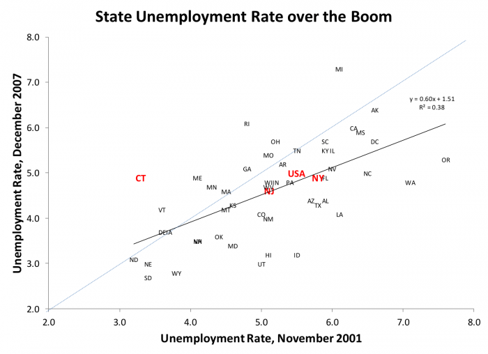
The first thing we notice in Exhibit 1 is the extreme variation in state unemployment rates. A bit of this may be due to larger measurement errors when we drill down to smaller state samples, but most of it reflects true underlying variation in state economic conditions.
At the trough of the previous business cycle, the 2001 “Tech Wreck,” unemployment rates ranged from 3.2 percent in North Dakota to 7.6 percent in Oregon. At the peak, December 2007, South Dakota’s 2.7 percent unemployment rate was a low bar indeed for other states to match; while Michigan, reeling from structural problems in their automobile industry, clocked in at 7.3 percent. The national average unemployment rate did fall over the boom, but modestly, from 5.5 to 5.0 percent.
What about our local economies? New Jersey came in a little better than the U.S average with respect to the unemployment rate in both periods: 5.1 to 4.6 percent, trough to peak. New York was not far off, at 5.8 and 4.5 percent. In 2001 Connecticut had one of the lowest unemployment rates in the nation, 3.3 percent; its rate went up significantly during the boom, from second best in the country to just below the 2007 national average at 4.9 percent.
The dotted light blue line marks equality between peak and trough unemployment rates. States above the line – notably Connecticut, Rhode Island, and Michigan – experienced worse unemployment at the peak than they had before the boom. The economies below the line, notably Idaho, Louisiana, Washington and Oregon, were a lot stronger after the boom, at least by this measure.
The heavier black line is the regression line through the 52 data points. The fact that the regression line is flatter than the equality line tells us that those states with the highest pre-boom unemployment rates tended to see greater improvement. The R-squared statistic tells us that the unemployment rate at the beginning of the boom explains 38 percent of the variation in unemployment at the peak; or conversely, that 62 percent of the variation is unrelated to initial conditions.
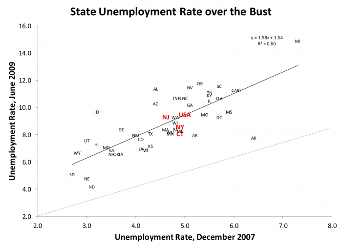
Exhibit 2 shows that unemployment over the bust – from the 2007 peak until the 2009 trough, according to NBER – is different in several respects. Take another look at Exhibit 1: during that boom, the majority of states improved (falling unemployment) but almost 20 states experienced increasing unemployment or stayed the same. In contrast, Exhibit 2 shows that everybody experienced rising unemployment during the bust. North Dakota, Nebraska and Alaska saw modest increases, but most states took big hits. Michigan was clobbered with an unemployment rate just shy of 15 percent by the time the NBER called a halt to the recession. The so-called “Sand States,” California, Florida, Arizona and Nevada that were especially hard hit by the housing crisis also saw large increases in unemployment, as did Idaho, Alabama and Oregon. The national average unemployment rate nearly doubled from peak to trough (5.0 to 9.5 percent), as did New Jersey (4.6 to 9.3 percent). New York’s and Connecticut’s increases were just a bit less terrible (4.9 to 8.6 percent, and 4.9 to 8.3 percent, respectively).
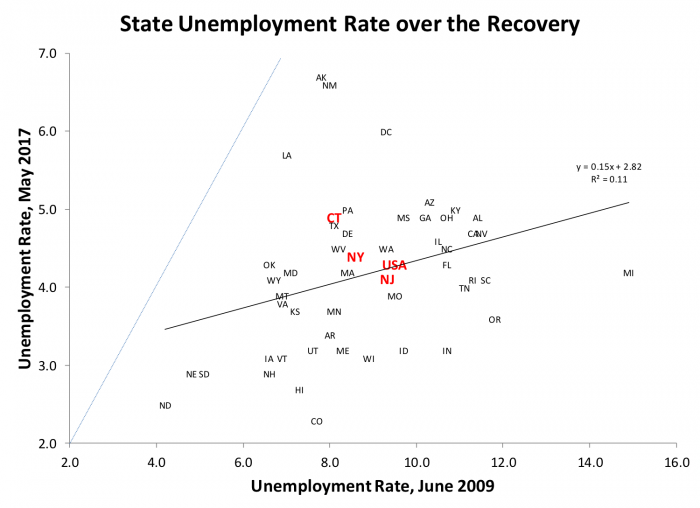
Exhibit 3 shows that the recovery has been in one sense, widespread. Every state is today substantially below their unemployment rate at the trough. The national unemployment rate was more than cut in half, from 9.5 to 4.3 percent; New Jersey’s decline was equally salutary, from 9.3 to 4.1 percent. New York and Connecticut unemployment rates also improved substantially, from 8.6 to 4.4 percent, and 8.1 to 4.9 percent respectively. A few states started out with low unemployment – the Dakotas, Nebraska – but even these saw improvement. The aforementioned “Sand States,” California, Arizona, Nevada and Florida, all improved. Michigan, our poster child for states in trouble, saw the greatest improvement, from 14.9 to 4.2 percent, a cut of two-thirds!
Employment and Income Growth by State, at Peaks and Troughs of the Business Cycle
To be sure, the unemployment rate is an oft-cited and important indicator, but as Dr. Coronado discussed, other indicators also matter. Gross domestic product, labor force participation, financial indicators, and employment and income growth would appear on any short list. We will finish up Part 1 of our look at state indicators with just two of these, employment and income growth rates; these are important in their own right, and do not always correlate perfectly with unemployment.
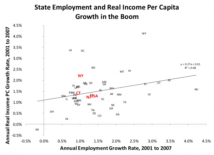
Since we are examining growth rates, a single number incorporates the change from trough to peak (Exhibit 4), or from peak to trough (Exhibit 5), or from trough to the present day (Exhibit 6). For these charts, we use annual data from the Bureau of Economic Analysis. These come with a longer lag than the BLS data used above, so in Exhibit 6 we will use 2015, the latest available, as our final endpoint.
BEA employment data are comprehensive, including both full time and part time employment; the calculation of growth rates is straightforward. BEA’s per capita income data is not adjusted for inflation, so the national GDP deflator is used to adjust these to 2016 dollars before we compute annual growth rates.
Exhibit 4 presents these two indicators for the boom period, 2001 to 2007. New Jersey mirrors U.S. growth in both these indicators. In the 2001 to 2007 boom, U.S. employment grew 1.4 percent per annum, and real per capita income grew at about the same rate. New Jersey’s corresponding employment income and employment growth rates were 1.2 percent and 1.2 percent, respectively. New York’s corresponding employment income and employment growth rates were 1.0 percent and 2.0 percent; Connecticut, 1.0 and 1.6 percent.
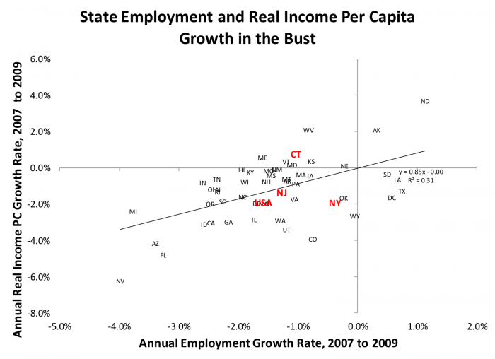
In the bust (Exhibit 5), U.S. employment fell 1.6 percent, and real per capita income fell 1.9 percent, per annum. For our local economies, New Jersey employment fell 1.3 percent, and real per capita income fell the same rate. New York’s employment fell only 0.4 percent per annum but income fell 1.9 percent each year. Connecticut’s employment fell 1.0 percent, but income rose at 0.8 percent over the bust years. Two states, Alaska and North Dakota, rode a commodity boom to modest increases in both employment and income during the bust. The Sand States were especially hard hit, with Nevada turning in the largest drops in both employment and real income per capita of any state. Florida, Arizona, and of course Michigan were not far behind; California also performed poorly, as did Idaho and Georgia.
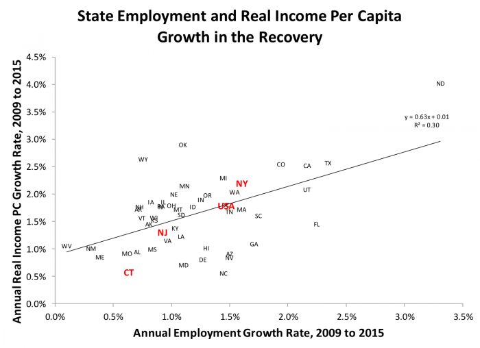
Finally, in the recovery, U.S employment rose 1.8 percent per year, according to BEA’s measure; real per capita income rose at a rate of 1.5 percent. New Jersey’s employment rose only 0.9 percent – half the rate of the U.S. – while its income growth kept up at 1.3 percent. New York’s employment growth was a bit behind the country, at 1.6 percent, but it turned in a stronger performance on the income side, with a real growth rate of 2.2 percent. Connecticut’s performance was weak across the board, with both income and employment growth clocking in at 0.6 percent per year.
Two of our Sand States, Florida and California, bounced back, although Nevada and Arizona continued to lag especially in income growth. Texas, Colorado and Utah performed well in the recovery, but the star, at least with respect to these measures, is clearly North Dakota; no surprise given the fossil fuel boom in that state. At the other extreme, joining Connecticut among the poor performers in the recovery we find West Virginia, New Mexico, Maine, Missouri and Alabama.
The Bottom Line
If there’s one consistent message across all three unemployment exhibits, it’s the huge variation in state performance around any month or year’s national average. The variation across states within a given month or year is roughly similar to the variation over time in the national measure, i.e. from the worst of postwar recessions to the strongest expansions. The statistician joke applies with particular force.
(The statistician joke: What’s a statistician? Someone who puts her head in the oven, and feet in the freezer, and says, “on average, I’m comfortable.” Then she computes a confidence interval and is clueless.)
Next time, we’ll explore some of the implications of this varying performance, for national monetary and fiscal policies; for housing and real estate markets; and for state and local governments.
Data
Want to examine the data used to create these charts in more detail? Click here to download the data in an Excel spreadsheet.