
Taking a longer run look at inflation and relative prices
Executive Summary: We extend several recent blog posts by taking a longer run look at inflation, and relative prices. We explain why the Fed leans more on the “core Personal Consumption Expenditure Deflator” than the more familiar CPI to track inflation. Broad patterns in consumption over the last 60 years give us some insight into prices and demand. Relative prices for a few interesting goods – health care, higher education, food, and consumer electronics – demonstrate that such relative prices can diverge from the overall price level over very long periods. This post sets the stage for a future post that investigates the relative price of housing in some detail.
Introduction
In her last two blog posts, Dr. Julia Coronado discussed the important subject of inflation in some detail. In her post a month ago, Julia discussed, among other things:
- Given its large share of the household budget, increases in housing costs are her “elephant in the room,” an important driver of inflation. Healthcare, “the gorilla,” is the other large driver.
- How we measure housing in the bellwether Consumer Price Index (CPI), and why we use rent as the basis of the housing CPI components for both renters and owners.
- Coronado pointed out that after the crash, while housing’s value, or asset price, fell from 2006 to 2010, during most of that period, rents, and therefore the housing components of the CPI were rising. This positive contribution to inflation from rent growth continued after asset prices also rebounded, circa 2010.
- Julia also noted that as the recovery continued, rent increases have started to moderate recently in many formerly hot markets. Along with slow recovery in consumer demand and wages, this recent rent moderation is contributing to continued moderate inflation pressures from the “real side” of the economy.
In her follow-on blog a week ago Dr. Coronado elaborated on her concerns about continued weakness in consumer demand, examining recent inflation in a range of goods and services. ulia suggested that these could signal concomitant inflation below the Fed’s target rate of 2 percent, and engender concern for the continued strength of what’s been a long but slow recovery. This means the Fed will need to stay flexible and data dependent for some months to come.
Given that she was looking at our current business cycle, Dr. Coronado’s focus was properly on recent prices, generally examining prices over the past five years. In this post (and in my next in a few weeks) I’ll examine prices too, taking a slightly different but complementary tack. After filling in a few more useful tidbits about definitions and measurement issues, we’ll examine some longer run trends in different prices, that put the cyclical changes the Julia discussed in some perspective. After the background material, today, we’ll look at long run trends in health, consumer electronics, education and FSBOs. Then in two weeks I will return to focus on long run trends (or, spoiler alert – lack thereof!) in real estate rents and prices.
Prices, and Inflation
It’s easy to confuse changes in relative prices and inflation. When the price of one good changes (holding other prices constant), that’s a change in relative prices. When all prices go up together – or some relevant, broad, weighted average of prices goes up – that’s inflation. When all prices go down together – or some relevant, broad, weighted average of prices falls – that’s deflation.
Let’s briefly discuss three important measures of inflation. We’ll start with the Consumer Price Index (CPI), the best known. It’s collected by the Bureau of Labor Statistics, and presented monthly. The CPI tracks changes in the goods people consume directly.
The GDP Deflator is collected by Bureau of Economic Analysis, quarterly. It’s the broadest index we consider here, covering all U.S. production and much of our consumption. Like the CPI, the GDP deflator has many subcomponents; one that’s especially important is the Personal Consumption Expenditure Deflator, i.e. the deflator used for consumption, which comprises about 70 percent of GDP. The PCE Deflator makes use of many of the same original data for the CPI, but they are combined using different weights and slightly different computational techniques.
Every month the Bureau of Labor Statistics sends employees to price thousands of items at retail outlets, apartments, and other establishments all over the country. These data are the raw material for the monthly Consumer Price Index, as well as the PCE Deflator, and hence a large portion of the GDP Deflator as well. BLS also regularly surveys consumers to determine the composition of the typical consumer’s “basket” of goods. The CPI in any month equals:
This particular kind of index is known as a “Laspeyres Index.” You can find many more details on the construction of these and other indexes at my course notes on the subject.
Many economists think the CPI tends to overstate true inflation; estimates of the upward bias range from 0 to 1 percent per year. While that doesn’t sound large, over time, cumulated, it makes a difference. Exhibit 1 compares our three measures of inflation, over time.
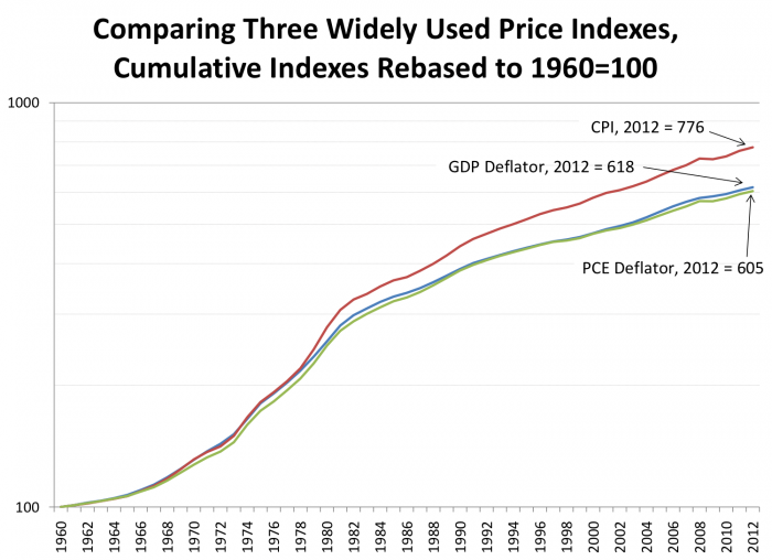
Exhibit 1
When you cumulate a lot of small changes, the differences can add up. You can see that over a long period of time, the GDP deflator yields a smaller increase in prices than the CPI. You also see that the GDP and PCE deflators are similar.
These are annual data. One advantage of the PCE deflator over the GDP deflator is periodicity. GDP and overall GDP deflators are only available quarterly. The PCE deflator is available monthly which is a big advantage when you’re trying to deflate monthly data.
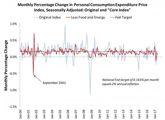
Exhibit 2
The U.S. central bank has a “dual mandate:” price stability and full employment. How do Janet Yellen and colleagues measure price stability? They look at dozens of price indexes, including the aforementioned CPI and GDP deflator. But primus inter pares is the personal consumption expenditure deflator (PCE deflator).
In fact, they don’t look first at the “ordinary” PCE deflator. They look at the “core PCE deflator.” Core PCE deflators (and also core CPI, which is readily available) strip out food and energy prices.
Why focus on core inflation? Food and energy are the most volatile components, as you can see from Exhibit 2. You can also see that their volatility tends to cancel out. Big increases in a few periods are usually followed by big decreases in later periods. It turns out that this smoother core index is a better predictor of future inflation, which is what the Fed is worried about.
Also, you want “smooth” if you’re running the Fed. Monetary policy affects the real economy with long and variable lags. You don’t want Fed policy bouncing around every time oil or corn prices move one way or another.
Before Detailed Prices: Let’s Look Briefly at Expenditures
Drop an economist on some alien planet, and ask him or her what kind of data they want to examine to understand the unfamiliar economy, and the first thing they will probably ask for is data on prices. Ask the economist to teach a first course in economics, and they will probably offer to teach “price theory.” But part of understanding prices and their uses is learning about consumption. Consumption – what we spend on goods and services – is the product of the price of those goods and services, and the quantity we consume. Exhibit 3 uses data from the National Income and Product Accounts – the accounts we use to produce GDP – to examine how much we spend on different goods and services, broadly defined.
Remark: non-economists often confuse (1) expenditures, (2) prices, and (3) quantities. Especially in housing/real estate!
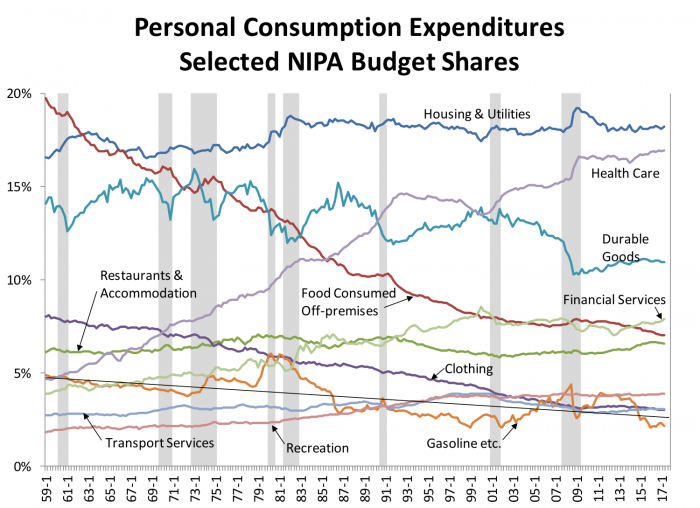
Exhibit 3
The housing and utility share is the largest. It’s based on BEA’s National Income and Product Accounts data, which means it is based mainly on rents – actual rents for renters, and estimated rents that homeowners would pay to lease units similar to those they own. Now at about 18 percent, it has risen slightly over the past half-century, though it does vary. In particular, housing’s share of consumption tends to rise slightly during recessions and fall during recoveries. That’s partly because housing expenditures are “sticky downward” when the economy tanks and overall consumption falls – the numerator of this ratio stays roughly constant, while the denominator, overall consumption, falls.
Notice the volatility and declining share of durable goods. In the 1960s, durables accounted for 13 to 16 percent of consumption; more recently durables’ shares have averaged a little over 10 percent. In a typical recession, durables – including automobiles, appliances (washers, dryers, air conditioners, etc.), and furniture, among other things – fall substantially, since these purchases are easier to defer than, say, food or transport or clothing. But while food and clothing don’t change much in the short run, with business cycles, there are some different and much more noticeable long run trends. Since the 1960s, there’s been a sharp decline in the food consumed off-premises (i.e. food purchased in a supermarket) as a share of consumption, and an even sharper rise in health care. Clothing has also fallen substantially as a share, from 8 percent in 1959 to 3 percent today. While restaurant meals, included with “accommodation” (hotels), have remained relatively constant around 6 percent.
Notice also the slow long-run downward trend in the share of gasoline and related fuels, from around 4 percent in the 1960s to 2 percent or so today. Notice also the extreme short-run volatility, reaching as high as 6 percent during the oil price shocks of the 1970s and 1980s. The long-run trend is due partly to increasing mileage, as consumer responses to higher gas prices, and government regulations took hold; the short run volatility is no surprise, given the well-known volatility in crude oil prices, as well as reductions in travel during recessions.
The other major change, obviously, is in the share of consumption devoted to health care, rising from 5 percent sixty years ago, to 17 percent today. Later we’ll examine changes in the price of healthcare, but it should be noted that a large part of the increase is in the quantity of health care we consume. Some of this increased quantity is due to is due to Medicare and Medicaid (starting in 1965), the Affordable Care Act (2010) as well as tax and other government policies that incentivize the consumption of health care.
Let’s Examine Some Relative Prices
We’ll defer housing and other real estate prices and rents until my next post. Today let’s examine a few interesting relative prices from other markets. Exhibit 4 presents the relative price of medical care. To reiterate, to compute a relative price, we compute the ratio of the price index of interest to some broad index; then we re-base it, if necessary, to fix the starting point (where the index value equals 100), and/or we compute percentage changes.

Exhibit 4
Medical care costs have risen dramatically, and with a few exceptions, steadily, for many years. “Why” is not fully understood. Certainly we consume more medical care now than we did 10 much less 50 years ago. 50 years ago things like MRIs and statins and bypass operations were unknown. Life expectancy was also almost a decade shorter!
But remember, if the BLS is doing this right, the CPI measures the price of medical care, not the quantity. There is almost certainly an upward bias to the index because it’s devilishly hard to avoid mixing some increasing Q with the increasing P. Part of the story is also probably related to the fact that people rarely consider price in choices about health care, in fact they rarely know prices of many procedures ex ante. There is a possibility that spending on health is a “luxury,” in that the income elasticity of demand is greater than one. If this were so, as our incomes increased we would demand a lot more and better health care. The studies I’ve read don’t seem to nail these demand elasticities down, so there may be something here. And of course the aging of the U.S. population could be a factor, as the baby boom hits the age when health spending goes up substantially.
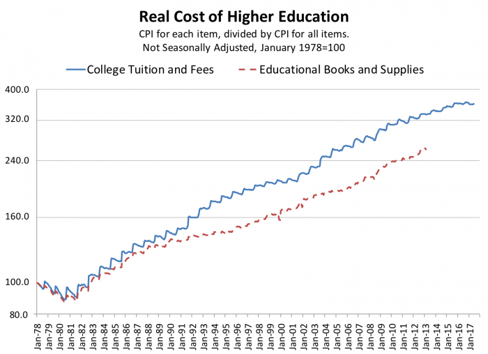
Exhibit 5
Since we’re together at a university blog, it’s of interest to see what’s been happening to the cost of higher education. Note that Exhibit 5 examines the CPI for all higher education costs; generally, costs at public universities like Rutgers have lagged the overall index over the long run.
Part of the rise in the real cost of higher education is probably due to what’s called “Baumol’s cost disease” in the economics profession. Some years ago the economist William Baumol noted that while there was rapid technical change in many parts of the economy, notably manufacturing, in some activities technology has changed slowly, sometimes very little – a live musical event, a haircut, nursing, many government activities – all are activities with slow rates of productivity growth; and it is rapid productivity growth that lies behind many of our most rapidly falling prices, as we’ll see below.
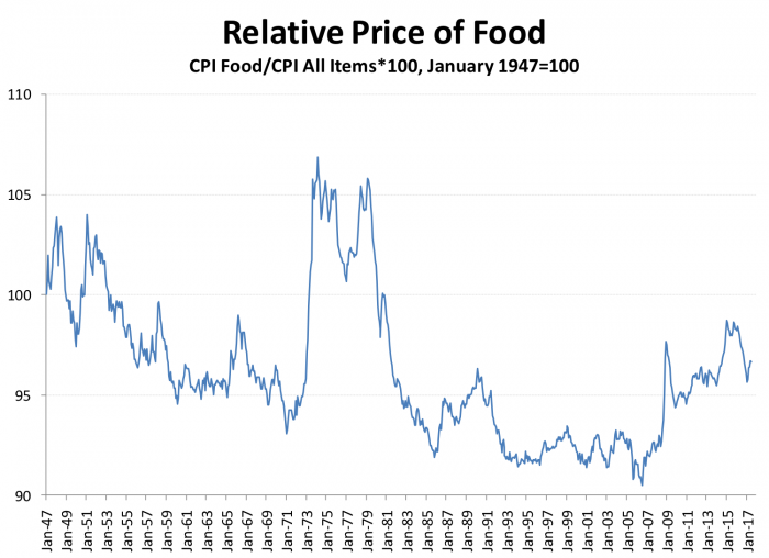
Exhibit 6
Not all relative prices go up – by definition! Every time somebody tells me we’re running out of farmland, I point out that the relative price of food has been falling for many years (Exhibit 6). What caused the temporary spikes in prices circa 1973 and 1981? These were driven partly by oil price hikes; oil is a critical input to modern agriculture, for transportation and fertilizer. What brought the relative price of food back down? What economists call “substitution in response to changes in relative prices” and “endogenous technical change”
When the price of oil spikes, at first farmers (and others) simply pay the new higher prices; and to the extent the market is competitive, they’ll pass these costs on to consumers as higher food costs. But given a little time to adjust, farmers and others in the agricultural supply chain can substitute, e.g. change to a fertilizer mix that is less petroleum intensive.
“Endogenous technical change” is about innovation in response to changes in relative prices. Perhaps when oil was cheap, the production of fertilizer used a lot of it, and trucks and tractors were not terribly fuel efficient. When oil is cheap, there’s not so much incentive to change; but when it triples in price, suddenly the scientists and engineers and firms who can deliver more MPG in a truck or a tractor, or reduce the petroleum feedstocks per bushel of output, can make a lot of money. Sometimes technical change and innovation are exogenous, as when Sir Alexander Fleming discovered penicillin, or when Charles Goodyear discovered the process for vulcanizing rubber, by accident. But more often it’s someone pursuing fame and/or fortune, and in these cases the incentives signaled by rising prices are just as important as scientific and engineering know-how.
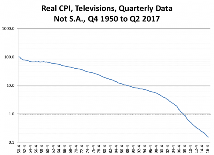
Exhibit 7
Consumer electronics, computers, etc. are another class of goods where relative prices have been falling like crazy (Exhibit 7). I’ve presented the relative price of televisions, since there are data going back to 1950. The price of a television is close to 1/1000 of the price of my childhood. (I show my age!)
You might wonder how we measure the price of something like a television, since 50s era TVs weighted a ton but had small black and white screens, full of vacuum tubes, with very low definition, poor sound quality, and many other shortcomings compared to the flat panel monster entertainment centers of today. The short answer is that BLS economists spend a lot of time using regression models and other so-called “hedonic adjustments” to correct prices for quality change in goods like TVs, automobiles, computers, and (of special interest to us) housing and other real estate. We’ll discuss these models, and there uses and shortcomings, in future posts.
By the way, the computing power measured by floating-point operations per second in my obsolete first-generation iPhone is just about the same as a $35 million Cray supercomputer in 1975.
More to Come!
Join me in two weeks when we take our first detailed look at housing prices!
Further Reading
Abbott, Philip C, Christopher Hurt, and Wallace E Tyner. “What’s Driving Food Prices? March 2009 Update.” Farm Foundation, 2009.
Andreyeva, Tatiana, Michael W Long, and Kelly D Brownell. “The Impact of Food Prices on Consumption: A Systematic Review of Research on the Price Elasticity of Demand for Food.” American journal of public health 100, no. 2 (2010): 216-22.
Baumol, William J. The Cost Disease: Why Computers Get Cheaper and Health Care Doesn’t. Yale University Press, 2012.
———. “Health Care, Education and the Cost Disease: A Looming Crisis for Public Choice.” Public choice 77, no. 1 (1993): 17-28.
Bodenheimer, Thomas. “High and Rising Health Care Costs. Part 1: Seeking an Explanation.” Annals of internal medicine 142, no. 10 (2005): 847-54.
———. “High and Rising Health Care Costs. Part 2: Technologic Innovation.” Annals of internal medicine 142, no. 11 (2005): 932-37.
———. “High and Rising Health Care Costs. Part 3: The Role of Health Care Providers.” Annals of Internal medicine 142, no. 12_Part_1 (2005): 996-1002.
Bodenheimer, Thomas, and Alicia Fernandez. “High and Rising Health Care Costs. Part 4: Can Costs Be Controlled While Preserving Quality?”. Annals of internal medicine 143, no. 1 (2005): 26-31.
Boskin, Michael J, Ellen R Dulberger, Robert J Gordon, Zvi Griliches, and Dale W Jorgenson. “Consumer Prices, the Consumer Price Index, and the Cost of Living.” The journal of economic perspectives 12, no. 1 (1998): 3-26.
Catlin, Aaron C, and Cathy A Cowan. “History of Health Spending in the United States, 1960-2013.” Centers for Medicare and Medicaid Services (2015).
Dunn, Abe, Scott D Grosse, and Samuel H Zuvekas. “Adjusting Health Expenditures for Inflation: A Review of Measures for Health Services Research in the United States.” Health services research (2016).
Fox, Douglas R, Stephanie H McCulla, and Shelly Smith. “Nipa Handbook: Concepts and Methods of the Us National Income and Product Accounts.” Bureau of Economic Analysis, 2014.
Gilbert, Christopher L. “How to Understand High Food Prices.” Journal of Agricultural Economics 61, no. 2 (2010): 398-425.
Mack, Chris A. “Fifty Years of Moore’s Law.” IEEE Transactions on semiconductor manufacturing 24, no. 2 (2011): 202-07.
Malpezzi, Stephen. “A Primer on Real Estate and the Aggregate Economy: Know Your Macro Indicators.” Madison, WI: James A. Graaskamp Center for Real Estate, 2011.
Moses, Hamilton, David HM Matheson, E Ray Dorsey, Benjamin P George, David Sadoff, and Satoshi Yoshimura. “The Anatomy of Health Care in the United States.” Jama 310, no. 18 (2013): 1947-64.
Nordhaus, William D. “Do Real-Output and Real-Wage Measures Capture Reality? The History of Lighting Suggests Not.” In The Economics of New Goods, edited by Timothy Bresnahan and Robert J Gordon, 27-70: University of Chicago Press, 1996.
———. “Quality Change in Price Indexes.” The Journal of Economic Perspectives 12, no. 1 (1998): 59-68.
Triplett, JE, and BP Bosworth. “Baumol’s Disease” has Been Cured: It and Multifactor Productivity in Us Services Industries. The new economy and beyond: past, present and future (2006): 34.
Waldrop, M Mitchell. “The Chips Are Down for Moore’s Law.” Nature 530, no. 7589 (2016): 144-47.