Taking stock: Five key financial market developments in 2018
Financial market developments in 2018 surprised in a number of ways. Toward the end of the year we learned that the stock market is still subject to the laws of gravity after many years of a bull run. In contrast to a political narrative that Fed rate hikes were the cause of the recent equity correction, a key catalyst appears to be deteriorating earnings expectations for 2019 that in turn are tied to a slowing global economy and disruptive trade policies. The global economy and capital markets provided poignant reminders in 2018 that no country can go it alone. Inflation also proved to be benign despite rising concern early in 2018, a development also in part tied to weaker global growth. Despite rising Treasury issuance from widening fiscal deficits, the yield on the 10-year Treasury rose only moderately and the longer-run equilibrium yield appears to lie below 3%. Despite the correction in risky asset valuations in the last three months of the year, pricing in stock and bond markets do not currently support the idea that the US is heading for a recession, or that monetary policy will be the cause. The slowing in the global economy is a notable downside risk to the outlook, but investors expect monetary policy makers will react accordingly in an attempt to achieve the historical rarity of a soft landing.
Development One: The stock market is subject to the laws of gravity after all
After soaring more than 19% in 2017, the stock market continued to surge early in 2018 achieving a new all-time high on January 26 before entering a turbulent period as inflation expectations and bond yields rose. The US stock market shook off the malaise reaching new highs in late summer, seemingly impervious to both bad news on trade negotiations as well as rising interest rates as a red-hot economy led to expectations for further rate hikes from the Fed. The S&P 500 index reached a new all-time high on September 20 before trading sideways and beginning a correction in October.
Figure 1: Analysts Have Been Downgrading Their Expectations for 2019 Earnings
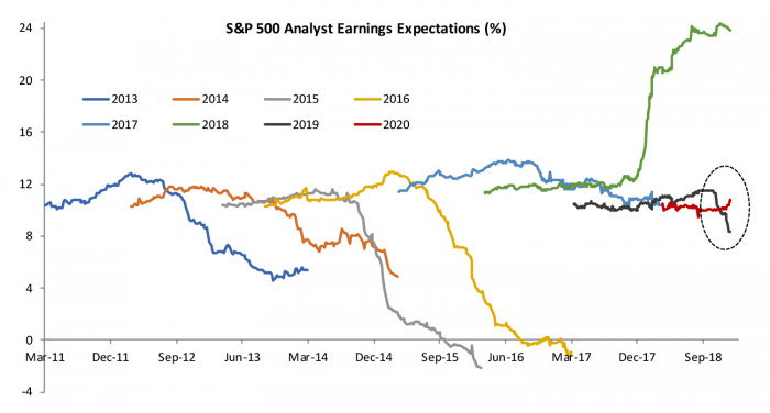
While political narratives have focused on the Fed’s rate hikes as the catalyst for the equity correction, Figure 1 illustrates what is a more likely central driver. Figure 1 shows analyst earnings expectations for companies in the S&P 500 starting two years in advance and then tracing how those expectations evolve until earnings are realized. After what is likely to materialize as a record year of corporate profits fueled by the tax cut in 2018, the Q3 2018 earnings season brought early warnings of weaker earnings in 2019 than previously expected. Through December 27, analysts had downgraded their expectations for S&P 500 by 3.2 percentage points, or 28% since early October (circled period in the graph). In their earnings calls, bellwether companies cited a slowing global economy and challenges related to trade disputes as catalysts for a less buoyant outlook.
Figure 2: Changes in Analyst Expectations and Valuations by Sector for S&P 500 Stock Index
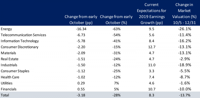
If markets were driven primarily by fundamental valuations based on disciplined discounting of future earnings streams, a record year like 2018 that isn’t expected to persist should not lead to surging valuations, nor should a downgrade to 2019 that is expected to be a one-off lead to a significant market correction. However, as we have often pointed out on this blog, since Keynesian times liquid markets tend to extrapolate and speculate on news leading to overly extreme dynamics in both directions. Figure 2 breaks down changes in earnings expectations since early October by sector and compares it to changes in valuations. Market valuations have declined by roughly half the decline in earnings for 2019 in percentage terms. The biggest declines in both earnings expectations and valuations have been concentrated in energy and technology-related sectors. Market valuations have been more bearish than analysts for the industrial and finance sectors.
It is worth noting that overall analysts are still expecting a relatively solid 8.3% growth performance for S&P 500 companies overall with three sectors anticipated to register double-digit gains. Neither earnings expectations nor current valuations in the aftermath of the recent correction suggest the market is priced for a recession. That is good news if analysts and investors are right, but also suggests we could see a larger adjustment if the economic outlook deteriorates.
Development Two: The US can’t go it alone
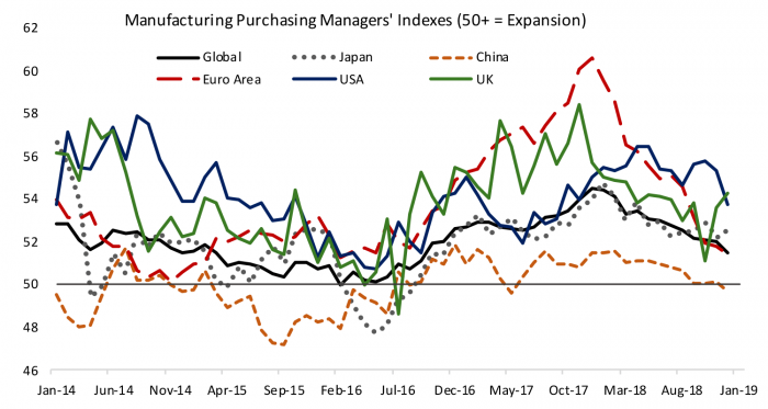
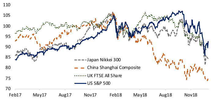
Slower economic growth and declining fiscal capacity are contributing to rising nationalist political sentiment around the world. However, in 2018 the global economy and capital markets reminded us how interconnected we are. Led by a pullback in stimulus in China and a slowing in Europe, the global economy disappointed optimism that the synchronized global expansion of recent years would continue through 2018. Figure 3 shows indexes of manufacturing growth for several major economies; the correlation and the leading role played by the Chinese economy are evident. The US defied gravity on the back of substantial fiscal stimulus through most of the year, but recent regional and national indicators point to a moderation. US companies both export into and profit from global growth so the US economy and financial markets will inevitably be tied to global developments. However, just as US manufacturing has slowed less than other countries, Figure 4 illustrates that the correction in US equity valuations was smaller than other countries. The S&P 500 ended down 6.6% for 2018, but that was slightly better than markets in the UK and Japan, and substantially better than the Shanghai Composite Index in China which fell more than 25%.
Figure 3: Global Manufacturing Activity Slowed Through 2018
Development Three: Inflation still isn’t a problem
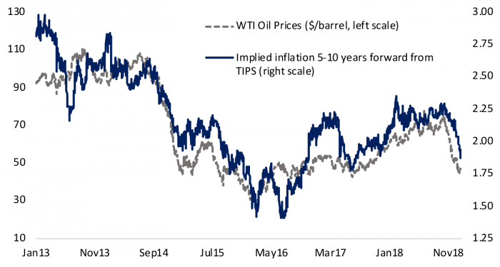
Inflation was a front burner issue at the start of 2018 with many observers wondering whether the Phillips Curve relationship between unemployment and inflation was poised to re-emerge as the labor market continued to tighten. As we closed the year the verdict seems to be that the Phillips Curve is still fairly flat, and inflation is not a concern, in part due to a slowing global economy. Figure 5 illustrates the close relationship between oil prices, which are increasingly driven by global demand conditions in a world of elastic supply, and the compensation investors demand for inflation in Treasury Inflation Protected Securities (TIPS) five to ten years from now. It is somewhat surprising that investors’ inflation expectations over a longer horizon are so closely tied to short-term commodity prices, except that both are responsive to the health of the global economy.
Figure 4: Global Stock Indexes All Deflated Substantially
Since 2014 inflation expectations as gauged by the TIPS market had been stuck at levels that suggest inflation will get stuck just below the Fed’s 2% target. Inflation sentiment as measured by both oil prices and TIPS were on the upswing early in 2018 but ended the year essentially back where they started despite a seemingly robust US labor market. The Fed closely monitors TIPS as a gauge of inflation risk and policy makers can be relatively sanguine that they are not raising rates too slowly, a narrative that was more prevalent at the start of 2018.
Figure 5: Near- and Long-Term Inflation Indicators Fell at Year End
Development Four: The equilibrium yield on the 10-year Treasury is probably below 3%
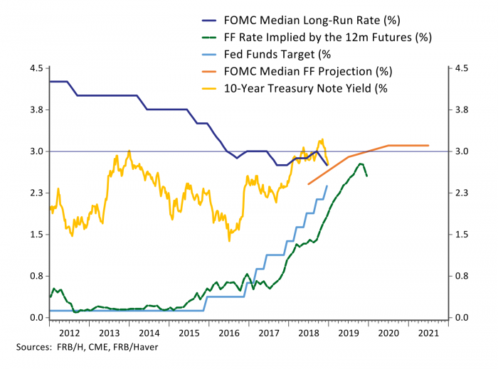
A doubling in Treasury issuance from a widening federal deficit, rising wage growth from a tight labor market, a Fed that was raising short-term interest rates and a synchronized global recovery that pushed commodity prices higher combined to push yields on the 10-year Treasury bond substantially higher early in 2018. After averaging below 2.5% between 2014 and 2017, the 10-year treasury yield jumped 50bps early in 2018 to 2.95% in late February. The 10-year yield moved above 3% temporarily in May and then again in late September before falling back during the correction in risky asset prices to end the year at 2.68%. The Fed and investors have been marking down their estimates of long-run equilibrium interest rates in recent years. Fed officials have highlighted that it is not something they can know with precision and must calibrate through careful monitoring of the economy’s performance.
Figure 6 shows that the Fed nudged its estimate of the longer-term equilibrium federal funds rate higher early in 2018 to a median 3% by the September FOMC meeting, before nudging it back down to 2.75% at the December meeting. One indication that we are closer to equilibrium interest rates is that interest-sensitive sectors quickly responded to higher rates. Mortgage rates followed Treasury yields, rising above 4.5% by April and nearing 5% by November after averaging close to 4.0% in recent years. While still low by historical standards, a 0.5% increase in mortgage rates implies a 6% increase in the payment for a median home. Combined with steadily rising home prices, would-be first-time homebuyers saw the cost of a home rise substantially faster than wage growth in 2018. Existing home sales have fallen 7% through November, housing starts have fallen 3.6% and residential investment is on track to subtract roughly a tenth from GDP growth in 2018. As noted in the last blog post, auto sales have also plateaued. A flattening in interest sensitive demand suggests the Fed is quite close to a neutral setting.
I concluded in a post in March that longer-term yields were unlikely to rise much above 3%. One rule of thumb favored by investors for longer-term equilibrium yields is a long-run average of real GDP growth plus inflation. I showed that, barring an inflationary period starting from the late 1970s through the late 1980s, 10-year Treasury yields have averaged roughly 1% below a 10-year average of nominal GDP growth, which currently stands at 3.8%. Risky asset valuations also proved sensitive when 10-year Treasury yields rose above 3% last year, another indication that a neutral equilibrium rate may lie just below 3%.
Figure 6: Interest Rates are Close to Longer-Run Equilibrium Levels

Development Five: Market pricing isn’t consistent with the idea that the Fed will cause a recession
There has been a political narrative that the Fed is both responsible for the stock market correction and is threatening to push the economy into a recession. That narrative is not consistent with current market pricing or communication from Fed officials. Investors have been watching the yield curve for indications of a recession. When the spread between the 10- and 2-year Treasuries becomes negative, a recession tends to follow over the next 12 to 18 months. Figure 7 shows that the yield curve has flattened but remains positive, in part because investors expect the Fed to respond to market and global developments and raise rates less than was priced in mid-year when the economy and markets were running hot. Investors were pricing in three rate hikes during 2019 in September and now are barely expecting one. The Fed has promised to be data dependent and has clearly signaled its intention to guide the economy to a soft landing. While soft landings are a historical rarity, investors expect the Fed to respond to recent developments and the yield curve doesn’t yet signal the Fed won’t achieve its desired goal.
Figure 7: The Yield Curve Retains a Positive Slope