
As in the old parable, how we understand employment data depends on what we see
Executive Summary: Today we’ll continue our look at employment data, in several of its many guises. We’ll briefly further examine national total employment, and labor force participation. We’ll spend much of the post examining employment in several key sectors, namely construction, manufacturing, education and health, several components of office employment, and government employment. An addendum to the post summarizes some of the key data sources for employment.
Introduction
Several weeks ago my colleague Julia Coronado introduced readers of this blog to some basic data on employment, with a focus on unemployment rates but some discussion of employment, labor force participation, and other important elements. I followed up with a look at unemployment rates, employment growth, and income growth, focusing on differences among states. But there’s still a lot to learn about this key economic indicator. Today we’ll take yet more looks at the elephant, I mean, at employment.
National Employment, Unemployment, and Labor Force Participation
The unemployment rate that was the focus of Julia’s previous post, and half of mine, is the most commonly cited and analyzed employment indicator, especially among macroeconomists. The second most popular is total employment, presented in Exhibit 1. The monthly employment and unemployment release is probably the most carefully watched economic report in the U.S. (except for the day’s stock market prices – and unlike daily stock market prices, monthly employment contains some real information on the state of the economy). Employment is often viewed as a fundamental driver for many real estate markets.
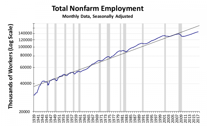
Exhibit 1
Exhibit 1 shows that over the past 75 years, U.S. total nonfarm employment grew from about 30 million to about 146 million today, by the most commonly used measure. (There are actually quite a few measures of employment; see the Data Appendix at the end of the post for an introduction to some of the most important).
Notice that Exhibit 1 presents the level of employment in logarithmic form; that allows us to interpret the slope of the line as the growth rate. The solid black line is the long run trend in employment. The gray bars indicate periods of recession.
A thing of beauty? Yes, the chart is beautiful, but not the results. Notice the disappointing performance post 2008. We took a big hit in the great recession; and while since the recovery started employment is growing, employment growth is still a bit below trend. And remember, since trend is an average of growth rates across recessions and expansions, we expect employment to grow faster than trend during an expansion.
Exhibit 1 shows total employment, across all sectors, and across all locations. We saw in the previous post that employment growth (as well as unemployment) varies a lot across states. Shortly, we will show that different sectors/industries exhibit very different growth rates as well. But first let’s explore the aggregate numbers just a bit more. After a review of basic definitions, we’ll examine the key issue of labor force participation. Then we’ll disaggregate, first by industry/sector, then by state.
Basic Employment Definitions Reviewed
Quiz time! How well did you study Dr. Coronado’s discussion of the various definitions and concepts? Here’s your study guide:
Employed: those working (full or part time) in the past week.
Unemployed: 16 years or older, not institutionalized (prison, military, student) and have looked for work in the past 4 weeks.
Labor force: the employed plus the unemployed.
Labor force participation: fraction of civilian non-institutional population 16 years old and over a given population that’s in the labor force.
LFP ignores “discouraged workers” who want to work but haven’t searched in the past 4 weeks. To include these, an alternative to LFP, an employment to population ratio is often calculated using the “prime working age” population, 20 to 64, for the denominator. This measure is also imperfect, as we’ll discuss below.
Unemployment rate: unemployed divided by the labor force; i.e., the fraction of labor force that’s out of work, and actively seeking work. This is the headline “U-3” rate. There are other unemployment rates, as Julia discussed.
Why Is Employment Growth So Disappointing While Unemployment is at Record Lows?
As Dr. Coronado reviewed, the unemployment rate is low, possibly nearing the so-called “natural rate” where inflation begins to pick up, and the Fed starts picking up the punchbowls to take them away (at least if you believe in Professor Phillips’ famous curve). But in our examination of Exhibit 1 we already noted that employment growth over the past 7 or 8 years has been, to use a technical term, “meh.” Why such great unemployment numbers, and yet lackluster employment growth? As Julia already explained, because of declining labor force participation. Let’s look again at that key measure directly, in Exhibit 2.

Exhibit 2
Dr. Coronado’s Figure 4 showed LFP since the mid-80s, but our Exhibit 2 presents labor force participation for some 70 years, to illuminate some longer-run trends. The numerator, the labor force, is once again the sum of employment and those actively looking for work. The denominator is the potential labor force, namely the civilian non-institutional population over age 16. The shifts up were especially strong in the early 1960s through the 1990s. These were largely driven by increased labor force participation of women, especially married women.
But notice that labor force participation fell before as well as during the recent recession, and has continued to fall during the recovery. The rate is back to a rate similar to that of 3 decades ago.
What lies behind this decline? Readers can find more breakout charts of labor force participation for different kinds of workers in my detailed class notes on employment. Here we’ll summarize some of those findings.
First, after peaking at about 60 percent in the mid-90s, and remaining at that plateau until the Great Recession, female labor force participation has declined to about 57 percent. Male labor force participation has been on a slow steady decline over three fourths of a century; from the high 80s circa 1950, to just below 70 percent today. And the pace of the male decline has picked up a bit since the Great Recession. So both males and females have contributed to the recent decline.
Next let’s consider LFP by age. As a card-carrying baby boomer (and one who “retired” from my academic job and now works mainly for fun, e.g. this blog), I’ve played my part in the decline in measured LFP. True enough, the decline is partly, but only partly, due to the advancing numbers and rising average age of the boomers’ cohort. Actually, since the 90s, LFP of the 55 and over group has increased from 30 percent to about 40 percent. So as a group, older folks are more likely to work than ever. But they are less likely to work than when they were in their 40s or early 50s; so the bulge in boomers hitting their older years, on balance, is bringing LFP down.
While the average LFP rate rose for the oldest measured group, the LFP fell for everyone else. It fell most dramatically for youngest: the LFP of the 16-19 group fell from the mid-50s in the 1990s, to the mid-30s today! The decline over the same period for the 20 to 24 group was less pronounced, from circa 78 percent to just above 70 percent today. The decline in prime age LFP, i.e. for those 25 to 54, was measurable but modest, from the mid-80s to about 81 percent today.
LFP also varies a lot by education level. The higher the level of education, the greater the rate of labor force participation. Interestingly, LFP has been declining for high school and college grads, but increasing somewhat for high school dropouts, albeit from a low level. Part of this may have been due to 1997’s welfare reform packages, where AFDC (Aid to Families with Dependent Children) was replaced with TANF (Temporary Assistance to Needy Families). TANF has more restrictions and more incentives, positive and negative, to get poor women with dependent children into the workforce.
Employment by Sector
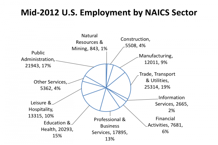
Exhibit 3
So far we’ve still been looking at national aggregates, for all kinds of industries and jobs. Now let’s break down employment by sector. Economic sectors are defined by something called the North American Industrial Classification System (NAICS). Here’s a quick look at the relative size of the sectors, using the most basic (“two digit” data) in Exhibit 3.
This post is already a bit long, so we won’t look at every sector here. Data mavens can find a larger set of charts at my aforementioned class charts, available online. Let’s examine half a dozen favorites here.
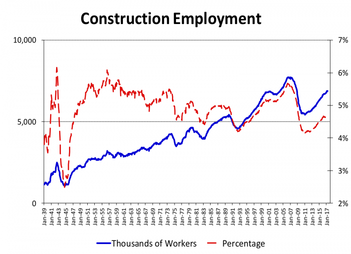
Exhibit 4
Construction employment is of great interest of all real estate professionals as well as those in the industry itself.
Exhibit 4 highlights the postwar growth of construction employment, as well as its cyclical nature and the changing trend as a share of employment through four decades from the 50s through the 90s. A few years ago, however, this pattern was reversed.
In 2007 construction employment peaked in total numbers around 8 million, and at a fraction of total employment, approaching 6 percent, that we hadn’t seen since the early 1950s. Then it crashed back down during the Great Recession numbers and ratios similar to those we saw back in 1990.
It’s been bouncing back slowly in the last 5 or 6 years. The number of construction workers is now at the level of about a decade ago; but it’s been 20 years since we’ve seen a percentage of construction employment as low as the 4.5 percent we see today.
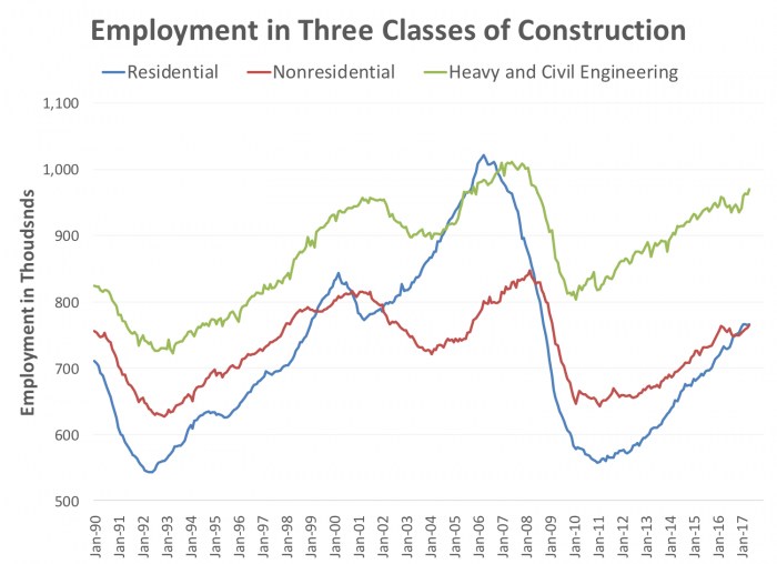
Exhibit 5
Of course there are different kinds of construction. Exhibit 5 shows residential, nonresidential, and heavy and civil engineering employment separately. While all three are clearly correlated, and all three are highly cyclical, it’s clear that residential construction employment is much more volatile than the other two.
Office, retail, infrastructure all took their hits in the Great Recession. But it’s been housing construction that saw the biggest drop, and the weakest recovery.
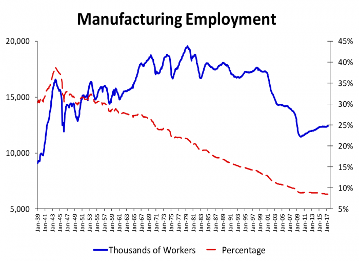
Exhibit 6
Exhibit 6 shows another bellwether sector, namely manufacturing employment.
Manufacturing employment grew in numbers throughout the 50s 60s and 70s, to level out around 17 to 18 million from the 80s until the tech wreck of 2001. Then the number has fallen steadily for most of the last decade, stabilizing around 2010, then growing slowly.
What about the share? Since World War II the share of employment in manufacturing has been in steady decline, from about a third of the labor force at the end of the war to 8 percent today.
While manufacturing employment has fallen as a share of employment, real manufacturing output [not shown] has grown substantially; and other data (not shown) tell us that U.S. manufacturing output as a share of total output has fallen only slightly since the 1950s, from about 16 percent then to about 14 percent today.
Why has employment fallen while output has grown? A strong increase in manufacturing labor productivity, or output per worker. Studies of the determinants of declining share of manufacturing employment demonstrate that the lion’s share of the shift is due to changes in labor productivity. Changes in demand patterns from goods to services, and competition from abroad, have contributed but have had more modest effects than rapid productivity growth.
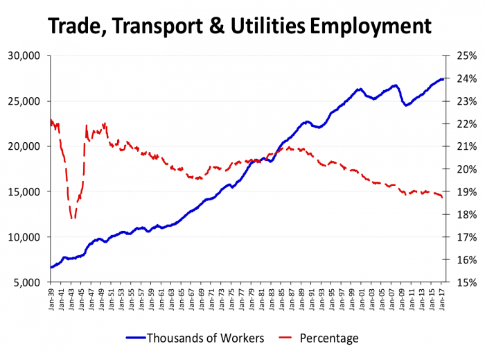
Exhibit 7
Exhibit 7 shows a “supersector” that includes transportation and utilities as well as wholesale and retail trade. If you are into industrial real estate, especially warehouses, or transshipment, or retail, you will want to follow this series, and break it out further.
We see moderate growth in the levels of employment in the sectors but a slowly declining share. Broadly, transport has become much more efficient, as the revolution in supply chain technology and organization has taken place. More detailed breakdowns (not shown) show that retail employment, one of the largest sectors and an entry point for many workers with modest educational backgrounds, took a large hit in the recession, falling from 15.5 million workers to about 14.3 million at the 2009 trough. Since the recovery took held, retail employment slowly climbed back and is now at about 15.9 million. But many observers believe the long run outlook for retail is not sanguine. Further technical change – self checkouts, e-commerce and, within both traditional bricks and mortar retail and internet commerce, ever increasing automation may well lead to substantial reductions in retail employment.
Wholesale trade has recovered even more slowly, still to return to pre recession levels. And the trucking industry, a traditional path to the middle class with modest educational backgrounds that currently employs 1.5 million, may well see declines in employment as truck driving becomes automated.
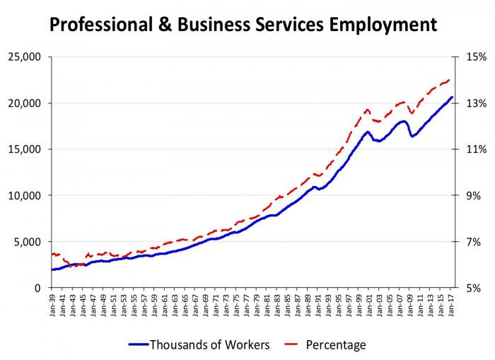
Exhibit 8
Often real estate analysts examine “FIRE” employment (Finance, Insurance and Real Estate; now officially called “Financial Services” in NAICS, although many still use FIRE as a shorthand label) as a proxy for office employment.
Exhibit 8 presents another category of employment that includes a lot of office workers. As Exhibit 3, above, shows, Professional and Business Services is actually a lot bigger than the FIRE category even though some analysts of office markets still focus primarily on FIRE. Both have broadly similar patterns, although this Professional and Business Services employment has done better than FIRE, as you can see by examine the more complete set of charts online.
That brings up an idea for a future post. Most real estate analysis including this post focus on industries or sectors, by NAICS code and their predecessor SIC codes. These don’t always map as well into property types as we might assume. For example we think of financial services firms as containing employees who work in offices. We think of manufacturing workers as using industrial space. But of course there are plenty of managerial and administrative workers at General Motors or US Steel. There are certainly individuals who work for Goldman Sachs or Fannie Mae who are not sitting in offices during the workday. The Bureau of Labor Statistics provides alternative data, much less often exploited by real estate analysts, that allow us to get a better idea of how workers in each industry breakdown by job type which can help us improve our measures of real estate related data like office employment.
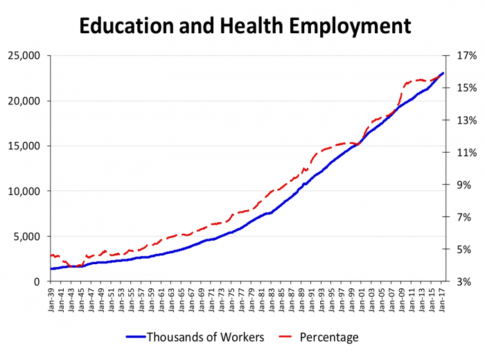
Exhibit 9
Not all employment is highly cyclical, as Exhibit 9 demonstrates. If there is a recession in education and health employment, it’s hard to see here. Other data in the online charts show that education growth has been steady but, unsurprisingly, health employment has the most rapid growth within this group of industries.
By the way, even though they are government employees and will show up again in Exhibit 11, public school teachers both K-12 and your friendly Rutgers University professors are included in this category.
This is recent history; what does the future hold? The well-known aging of the baby boom will drive health-care expenditures up. Changes in healthcare costs and financing will also drive changes in this sector’s employment, despite efforts to “bend the cost curve” down.
On the other hand, education faces some trends that may reduce employment. First, we will see declines in school-age children as the large Millennials cohort ages out of school age. Second, technical change may finally, in due course, lead to increased productivity in education, at least at the university level.
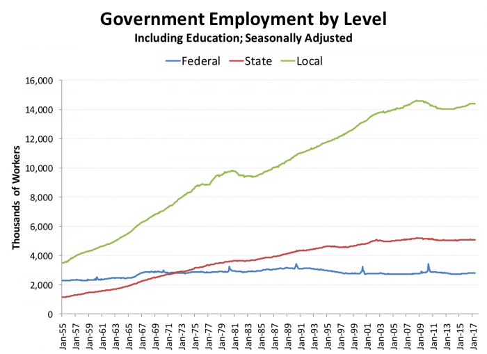
Exhibit 10
Exhibit 10 presents employment in the three main levels of government. Government employment includes public schools. That’s a big chunk roughly 10 million of the 22 million public sector employees. Some of these government workers also appear in the education and health data in Exhibit 9.
The fact that federal government employment (civilian) is roughly the same today as it was 50 years ago surprises many on first viewing of this Exhibit. Of course virtually any other measure of federal government activity would show a significant increase over these decades. Federal employment is always a hot-button political issues, and one thing that Republicans and Democrats have agreed on over the years is the desirability to mask increases in federal employment by hiring contractors instead of increasing the federal workforce directly. CBO has attempted to estimate the number of federal contractors but found that making reasonable estimates impossible with current data systems. Their first efforts suggest that such shadow employees may easily be another million, possibly more.
The spikes every ten years are, as you already guessed, the temporary federal employees hired for each decennial Census.
The Bottom Line
Readers of this post will come away with a deeper understanding of the interplay among employment, unemployment, labor force participation, and other key concepts. But the major takeaways are about how different industries and sectors can diverge from overall employment. Manufacturing is the new agriculture; it’s relative decline as a share of employment has been taking place over decades, and it will not be back, whatever we’d like to see. Construction employment is very highly cyclical, especially residential construction. Trade and transportation have done better, but they may be facing their own productivity paradox: coming improvements in technology in these sectors may slow future employment growth, and will almost certainly require levels of training and education beyond today’s requirements. Education and health have, so far, been the stars of employment growth, but each is also facing changing environment that makes us wonder if the past is a good guide to the future of employment.
In our next employment post, first we’ll return to state data, documenting a key point about the relationship between state employment growth and state population growth. Then we will examine sectoral differences in employment growth in New Jersey using techniques of “location quotients” and “shift-share analysis.” Future posts will then bring these findings around to how they affect, and are affected by, housing and other real estate markets.
Sources and Further Reading
Davis, M. A. (2009). Macroeconomics for MBAs and Masters of Finance, Cambridge University Press.
Freeman, R. B. (2007). America Works: Critical Thoughts on the Exceptional U.S. Labor Market, Russell Sage.
Lyons, K., et al. (2017). A Revitalized Pittsburgh Says the President Used a Rusty Metaphor. New York Times.
Malpezzi, S. (2011). A Primer on Real Estate and the Aggregate Economy: Know Your Macro Indicators. Madison, WI, James A. Graaskamp Center for Real Estate.
Mishel, L., et al. (2012). The State of Working America, Cornell University Press.
The Economist Sorry, We’re Closed: The Decline of Established American Retailing Threatens Jobs.
U.S. Bureau of Labor Statistics (2014). How the Government Measures Unemployment, BLS Current Population Survey Technical Documentation.
White House (2016). The Long-Term Decline in Prime-Age Male Labor Force Participation.