
Market directions in key metropolitan areas tell a complex story
We constructed real housing price indexes for 233 metropolitan areas, quarterly, from 1990 to 2017, combining hedonic and repeat-sales methods. In this blog post we present exploratory data analysis, focusing first on a dozen and a half metropolitan areas such as San Francisco, Chicago, Denver and Las Vegas. Then we turn our focus to the tri-state region, examining the price indexes in New Jersey, Connecticut and New York and a few other neighboring locations.
Introduction
Since its inception last spring, we’ve run a number of posts about housing prices here at the Rutgers Center for Real Estate Blog. Our entry on affordability laid out some definitions, and presented a set of state-wise comparisons of rents and house values. Next, Center Academic Director Morris Davis examined some aspects of risk and return to single-family housing in New Jersey, including an analysis of zip code level data. We then examined how some housing policies, specifically rent control and inclusionary zoning, and conditions in financial markets, affect rents and prices. My colleague Julia Coronado then turned the last point on its head, and pointed out that causality can run both ways: housing market conditions in turn can affect financial policies and conditions. Two more posts appealed to our readers’ inner data geek: some of the technical issues that arise in measuring housing prices, and a look at the ins and outs of several commonly used housing price indexes.
At the end of that most recent post, we promised a look at housing prices by metropolitan area. Several hurricanes intervened (see blog posts of 8/24, 9/14, 9/21, and 10/5), but today – promise fulfilled.
“Units of Observation” Matter
Whenever we examine economic data, including housing prices, we have choices to make. Do we look at national numbers? Or even global numbers? Or state data, or regional data, or do we drill down further? Today we’ll focus on metropolitan level data.
Metropolitan areas are smaller than states, but bigger than single cities or towns. They are meant to comprise a locus of addresses that approximate a labor market, and a housing market.
We’ll briefly explain the details of metro definitions below. Most readers will readily agree that while New Jersey as a state has many commonalities, housing and economic conditions might meaningfully diverge between, say, Newark and Trenton; or between Atlantic City and Camden. Ditto for New York City and Albany, or Stamford and Hartford.
While we are going to drill down to the metro level today, clearly we could go further – to counties, to municipalities, to ZIP Codes, or census tracts. Papers by Follain and Malpezzi, and by Davis and Oliner are examples of studies of house prices at the smaller geographies. Current research by Morris Davis and colleagues is generating new price indexes at the census tract level for much of the country. I’m sure we’ll hear more about these in a future blog post from Morris, as the data come online.
We should note that any price index is an imperfect guide to the prices of individual units as studies by Boudry et al., by Follain Kogut and Marschoun, and by Malpezzi, Pollakowski and Simmons-Mosley confirm.
Metropolitan Areas and Divisions
Metropolitan areas are built up of selected counties. While only a small part of the United States is urbanized, the entire country is covered by counties. Specifically, there are 3141 counties or county equivalents in the United States. County equivalents include things like the parishes of Louisiana, and a few special places like several large national parks.
Metropolitan areas comprise one or more central or principal cities, the county (or very occasionally counties) that contain them; and very often additional contiguous counties which are economically linked to the central city(ies). The cut-off for a city size that would anchor a metropolitan area is, with a few exceptions, 50,000.
There is a smaller but not negligible part of the country that is functionally urban, but where cities were smaller. In response in 2003, Census came up with the concept of a micropolitan area. A micropolitan area is anchored by a principal city of somewhere between 10,000 and 50,000. As it happens, New Jersey doesn’t have any micropolitan areas, although Connecticut has a few (Torrington, Willimantic) and New York has 15 (e.g. Corning, Plattsburg, Seneca Falls).
Metropolitan areas and micropolitan areas together comprise what we call Core Based Statistical Areas, or CBSAs.
The larger metropolitan areas (New York, Los Angeles, etc.) also contain metropolitan divisions, which are large – they have a single core city of 2.5 million or more.
These can lead to data matching problems. Some basic sources, like BEA population and incomes, come for BOTH the large MSAs and their metro divisions. But some data only come for one or the other.
For example, Federal Housing Finance Agency housing price data come by Divisions, but not for the larger metro areas that contain divisions. That is, the Milwaukee data are for the Milwaukee metro area, because Milwaukee (and most metro areas) have no metro divisions. But LA, New York, Dallas etc. FHFA price data come for their divisions only, not for their metro areas.
On the other hand, Census data on building permits is available by metropolitan area, but not by metropolitan division. So research that needs to match up house prices and permits can’t just download the data and match up by metro name or FIPS code.
The official definitions of all these metropolitan and micropolitan areas, CBSAs and CSAs and so on, are set by the Office of Management and Budget, with technical assistance from the Census Bureau.
Today’s Index Is a Hybrid of Hedonic and Repeat Sales Models
In previous postings we briefly explain hedonic housing price models and repeat sales housing price models. In brief, the former are based on statistical models that relate value or sales price to characteristics of the unit, so we can construct a better approximation to a true price index that holds the size and quality of the unit constant. We use a metropolitan hedonic index by Malpezzi Chun and Green that calculates the asset price of a constant quality unit across 223 Metropolitan areas.
Unfortunately, the Malpezzi Chun and Green index was a one-time set of estimates for 1990. It’s not easy to find hedonic models that are repeated year-by-year, much less quarter-by-quarter, for a large set of “small” geographies. We want to examine the time path of prices across our metropolitan areas, so this brings us to the second component of our hybrid index, the Federal Housing Finance Agency repeat sales indexes. Recall from our previous blog that repeat sales indexes, properly calculated, give us an estimate of the percentage changes in prices over time, but they don’t tell us anything about the level of prices, that is the difference in dollar amounts between one metropolitan area and another. Repeat sales indexes can tell us that one metro area is growing faster or slower than the other, but nothing about the dollar differences.
Our hybrid procedure is simple. Begin with the Malpezzi Chun and Green hedonic price index to set levels in dollars of the asset price of a constant quality house in each metropolitan area in 1990. By constant quality house we mean the house that represents national averages of the size and quality measures in the characteristics regression that lies behind the Malpezzi Chun Green price index. Then we grow or shrink the dollar amount for each metropolitan area each quarter forward from 1990 using the FHFA estimates of quarterly price changes.
Once we compute these dollar values for each metropolitan area for each quarter, we then convert these nominal indexes into real (inflation-adjusted) indexes, deflating the nominal dollar amounts using the GDP deflator. See our blog on prices for details.
We calculated these indexes for 27 years or over 100 quarters for 223 metropolitan areas. Later we will be using this data for a more detailed study of house prices underway with my colleague Yongping Liang. See Liang and Malpezzi 2017 for a very rough draft. We will release the full data set when the paper is ready, but at the end of this blog you can see some summary statistics on the prices for New Jersey metropolitan areas and others in the tri-state area. You can also obtain the summary statistics for all 223 Metropolitan areas in an Excel spreadsheet by clicking here.
House Prices in Seventeen Interesting Metropolitan Areas
Let’s begin by looking at 17 of the 223 Metropolitan areas that aren’t part of the tri-state area but which are among those of interest to anyone thinking about house prices.
Exhibit 1 shows our hybrid index from 1990 to 2017, presenting real quarterly house prices, indexed for an average U.S. unit across nine metropolitan areas that are often cited as either high cost or extremely volatile.
“Exhibit A” among the data presented in Exhibit 1 is of course the remarkable time path of San Francisco housing prices. San Francisco had one of the biggest booms in the 2000’s, rising from under $500,000 in the mid-1990s in $2016, to $1.1 million at its 2006 peak. (We round numbers in the text; using more decimal points would imply a false precision.)
San Francisco also had one of the biggest busts in dollar terms by $330,000, some 30 percent. From that 2012 trough of $769,000, San Francisco boomed again after the 2012 turning point to even exceed its 2006 peak. We estimate that typical US housing unit in an average location in the San Francisco metropolitan division would be worth well over $1.2 million.
Booms and busts are cyclical phenomena. How do housing markets perform in the very long run? There is a large variation in the average annual real growth rate across our 27 year study period. If one had bought into the San Francisco housing market in 1990, on average one could expect an annual real return of 2.9 percent, unlevered, before the inclusion of substantial tax subsidies. But with high returns, of course, comes that other thing that begins with the letter R. Someone who bought in the San Francisco market at 2006, and had to sell five or six years later took a large capital loss. With higher returns come higher risks.
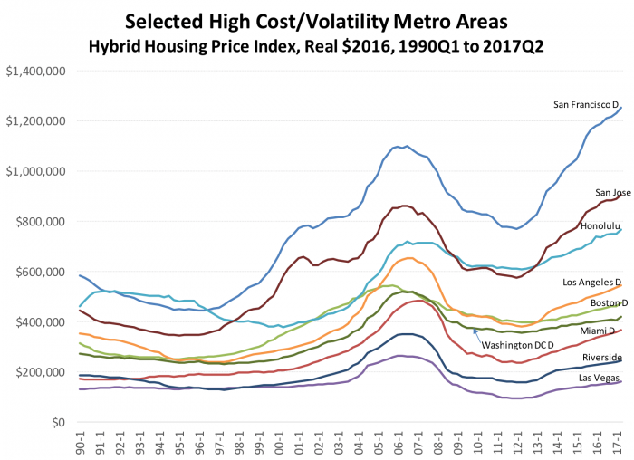
Exhibit 1
At the other extreme, Las Vegas, another oft-discussed housing market because of its high rate of foreclosures, exhibited a very large boom and bust in percentage terms. Our index indicates a 2006 peak of $262,000 (in $2016) but then prices fell by 64 percent to $94,000 in the 2012 trough. Even after the post 2012 turn and significant price increases, we estimate that a typical unit in Las Vegas would currently be worth about $161,000 in $2016 well, still below its 2006 peak.
This suggests another simple calculation that we can do is to compare the peak housing value in each metropolitan area with its current housing value to see if the housing market is likely to have a large number of underwater properties. Here we use nominal (not inflation-adjusted) values, since mortgage contracts are written in nominal dollars. The simple calculation is merely indicative, because the indexes mask the fact that there is a distribution of values both at the top of the peak and today. It’s perfectly possible for a number of units to be underwater in a market where the average value today is substantially higher than the peak, just as it is as it is possible for individual units to be well out of danger in a market where the averages suggest the opposite.
In San Francisco, the $1.1 million peak in $2016 implies a then-current value of $931,000, after we “undo” the inflation adjustment. Since today’s index value is $1.2 million, and prices have been rising recently, it’s no surprise that Zillow estimates that in Q1 2017 only 3.5 percent of homeowners in San Francisco county are under water, one of the smallest percentages in the country. In Las Vegas, on the other hand, even once we “de-adjust” the peak $262,000 to $223,000 in then-current 2006 dollars, current index values of $161,000 suggest significant numbers of homeowners will be underwater. Zillow’s estimate is that 15.9 percent of Clark County’s homeowners have mortgages larger than the value of their homes.
It might appear that risks are lower in markets like San Francisco, San Jose and Honolulu, where there was a big 2000s era boom and bust, but where the indexes are now well above their peaks after another more recent boom. But such markets may be substituting one risk, that of another future bust, for another that of being underwater today.
Exhibit 2 presents data for another 7 markets, purposely chosen to illustrate some other patterns.
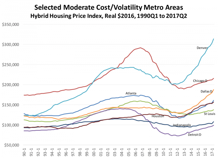
Exhibit 2
The charts presented in Exhibits 1, 2 3, 5 and 6 are similar, but notice that the vertical scales are very different. Exhibit 1 ranges from zero to $1.4 million so we can examine the time path of some real boomers like San Francisco. The vertical scale of Exhibit 2, on the other hand, ranges over less than 1/3 of Exhibit 1’s scale, from $50,000-$350,000, so that we can discern differences in the patterns among moderate metro areas.
Consider the pattern exhibited by the Midwestern bellwether, Chicago. Chicago’s index peaked in 2006 at $292,000 in $2016, or $247,000 in then-current $2006. Either way, with a current value of $215,000, there are still significant underwater mortgages in the Windy City. Denver, on the other hand, had a significant boom and bust, but it’s had one of the strongest post 2012 booms in the country. Denver peaked earlier than many other metropolitan areas. Prices really were flat for a while from 2002 through 2006, at around $240,000; after which a long slow slide brought prices to a 2012 trough of $200,000. But since 2012 prices have rebounded strongly, to a current value of $314,000.
Detroit was another metro area that peaked early. Its decline was substantial, prices fell by over half, from $140,000 at peak to $72,000 at the trough. Recovery has only brought this market back to a current value of $99,000, with a long way still to go.
House Prices in Tri-State Metropolitan Areas
Exhibit 3 presents our house price indexes for the five New Jersey metropolitan areas for which we have full data. The Newark metropolitan division (part of the New York metropolitan area) is the costliest of the five, and the market that exhibited the largest boom and bust in dollar terms. The market peaked at $518,000 in 2006 ($439,000 in nominal terms), fell by 27 percent to $376,000 then rebounded slowly to $397,000. It’s not surprising that Newark still has a lot of properties underwater. Zillow estimates that 12.4 percent of Essex County’s homeowners are underwater. But notice that Newark’s very slow recovery is better than flat-lining Trenton and Camden; and that Vineland and Trenton have, according to our index, yet to reach a noticeable trough. Cumberland County (Vineland) has about 17.8 percent underwater, and Atlantic county is just below 23 percent, according to Zillow.
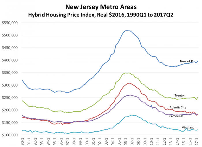
Exhibit 3
We present Zillow’s New Jersey estimates of the percentage of homeowners underwater as Exhibit 4. These estimates are provided by county.
Some of the New Jersey locations that we think are doing better are absent from Exhibit 3. Edison-New Brunswick and Ocean City don’t have sufficient data to estimate our indexes; and several counties are wrapped in to metropolitan areas or divisions that are dominated by other states. Some of these will be represented below in Exhibit 5, although the results will be driven mostly by homeowners outside New Jersey.
Bergen County is a particularly noteworthy example of the latter. It’s probably one of the best performing housing markets, all in, within the state. With a population just under a million, it’s the largest county in New Jersey, but has no large cities (Hackensack has only 45,000 people). Census and OMB include it in the New York Division rather than make it a separate micropolitan area. We’ll present this Division below, but of course those results will be driven more by New York City, even given Bergen County’s size.
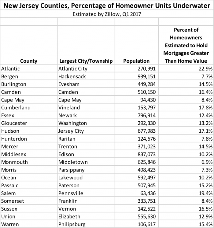
Exhibit 4
Exhibit 5 presents our data for the eight New York metropolitan areas or divisions for which we have sufficient data. It is immediately apparent that New York City’s metro division, and its companion to the east (Nassau) have very different price levels and price time paths than the other six metropolitan areas. Albany had a bit of a boom and more of a slow deflation than a bust. Syracuse, Utica-Rome, Binghamton and Rochester were fairly flat.
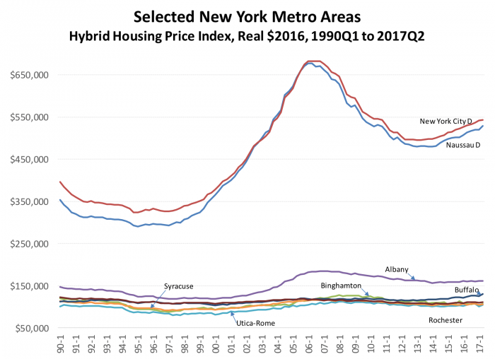
Exhibit 5
Nevertheless, New York City’s division (including, you’ll recall, Bergen County) peaked at $683,000 in constant dollars and $579,000 in nominal dollars. With a current index value of $543,000, New York has not yet made up all the ground high-LTV borrowers at the market’s peak have lost; but neither have they boomed so fast as to suggest a bust is imminent, at least from an eyeball examination of trends. Liang and Malpezzi have been examining macro models of turning points; so far, our research, and other studies extant, find that it’s very difficult to pick turning points in housing markets.
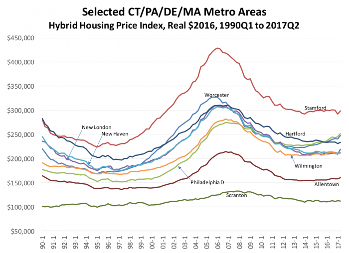
Exhibit 6
Exhibit 6 presents data for our five Connecticut metropolitan areas, along with a few from Pennsylvania, Massachusetts and Delaware which are closely connected to New Jersey.
It’s not entirely surprising that Stamford, Connecticut, famous as a bedroom community for the New York financial community, experienced a large boom and bust by the standards of the rest of these areas. Bridgeport-Stamford-Norwalk, to give its full name, peaked at $429,000 ($364,000 nominal), flattened out at around $300,000 circa 2014, and remains within a few thousand dollars of that amount today; another market that follows a similar path to many New Jersey markets.
The Bottom Line
Like the rest of the country, New Jersey was profoundly affected by the boom and bust in house prices over the past few decades. But our analysis shows that compared to New York City and its environs, as well as to Boston and the California markets, New Jersey was less volatile. The macroeconomic effects of the house price boom and bust of the Great Financial Crisis that followed the housing bubble did not spare many if any metropolitan areas, whatever their own house price levels or paths. Once the financial crisis took hold, although not every location was equally distressed, no one was exempt.
Most of New Jersey’s housing markets, measured at the metropolitan/division level, have stabilized or recovered. Atlantic City and Vineland have not shown much recovery, but at least the rate of decline has begun to approach zero. In New Jersey’s metropolitan areas and divisions, whether we measure peak prices in real or nominal terms, today’s Index come in significantly below those peak values suggesting units are still underwater. Markets like San Francisco and Denver, and to some extent New York City, have had bigger rebounds after 2012; after additional econometric work we’ll have a better idea of how much these stronger rebounds might translate into risks of a future decline.
It’s worth reiterating again that although these metropolitan-level price analyses are a big improvement over a focus on national or even state averages, future research by the Rutgers Real Estate Center and others that give us a time series of even smaller areas will certainly improve our understanding of these prices and their determinants in the months and years to come.
Data Appendix
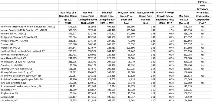
Exhibit 7
References and Further Reading
Boudry, Walter I, N Edward Coulson, Jarl G Kallberg, and Crocker H Liu. “What Do Commercial Real Estate Price Indices Really Measure?” (2012).
Calhoun, Charles. “Ofheo House Price Indexes: HPI Technical Description.” Washington, DC: U.S. Department of Housing and Urban Development, Office of Federal Housing Enterprise Oversight, 1996.
Corbae, Dean, and Erwan Quintin. “Leverage and the Foreclosure Crisis.” Journal of Political Economy 123, no. 1 (2015): 1-65.
Davis, Morris A, Stephen D Oliner, Edward Pinto, and Sankar Bokka. “Residential Land Values in the Washington, Dc Metro Area: New Insights from Big Data.” (2016).
Davis, Morris A, and Erwan Quintin. “On the Nature of Self‐Assessed House Prices.” Real Estate Economics (2016).
Follain, James R, and Seth H Giertz. “US House Price Bubbles from 1980–2010: The Role of Local Market Conditions.” The Nelson A. Rockefeller Institute of Government Working Paper. Albany, NY (2013).
Follain, James R., David Kogut, and Michael Marschoun. “Analysis of the Time-Series Behavior of Rents of Multifamily Housing Units.” In Annual Meeting of the American Real Estate and Urban Economics Association. Boston, MA, 2000.
Follain, James R., Jr., and Stephen Malpezzi. “Are Occupants Accurate Appraisers?” Review of Public Data Use 9, no. 1 (April 1981): 47-55.
———. “The Flight to the Suburbs: Insights Gained from an Analysis of Central-City Vs Suburban Housing Costs.” Journal of Urban Economics 9, no. 3 (May 1981): 381-98.
Frey, William H, Jill H Wilson, Alan Berube, and Audrey Singer. “Tracking Metropolitan America into the 21st Century: A Field Guide to the New Metropolitan and Micropolitan Definitions.” The Brookings Institution, 2004.
Liang, Yongping and Stephen Malpezzi. “Recent Price and Quantity Volatility in Metropolitan Housing Markets: A First Look.” James A. Graaskamp Center for Real Estate Working Paper. Madison, WI: University of Wisconsin, 2017.
Malpezzi, Stephen. “Residential Real Estate in the U.S. Financial Crisis, the Great Recession, and Their Aftermath.” Taiwan Economic Review 45, no. 1 (2017): 5-56.
———. “A Simple Error Correction Model of House Prices.” Journal of Housing Economics 8, no. 1 (March 1999): 27-62.
Malpezzi, Stephen, Gregory H. Chun, and Richard K. Green. “New Place-to-Place Housing Price Indexes for U.S. Metropolitan Areas, and Their Determinants.” Real Estate Economics 26, no. 2 (Summer 1998): 235-74.
Malpezzi, Stephen, Henry O Pollakowski, and Tammie X Simmons-Mosley. “The Distribution of Rent Changes within a Market, and Implications for Second-Generation Rent Control.” Unpublished Manuscript. University of Wisconsin (2005).
Saiz, Albert. “The Geographic Determinants of Housing Supply.” The Quarterly Journal of Economics 125, no. 3 (2010): 1253-96.
Zillow Research. “Q1 2017 Negative Equity: Slow Progress Beats No Progress.” 2017.